Tuesday, 28 April 2015

Methodology

My methodology focuses on concept building. I like clever design, design with a purpose, and design that stands out from the norm. It impacts me and motivates me to produce work that is different and stands out from the rest of the generic graphic design and makes me produce ideas that are unique.

I start with research, I look into, specific aspects of the research, push it the idea and find unique and experimental ways of finding the content and information. I then create my initial ideas, I tend to sketch, mock up, and create initial ideas to a final stage to portray how a design will look if it was digitally and try to vision whether the design will work or not. I then go back to my initial ideas and make sure that every part of my concept is written and planned to imagine how the end project will end up. I work my research into concepts and try to think of a unique way of showing this research and getting my point across. I work in a very ordered, structured manner, planning, producing notes and lists to complete, then making sure each aspect is completed before I feel I have sufficient content to start my initial ideas.

I would also like to work on my sketchbook designs. I believe the way I portray my information within my sketchbook becomes confusing and difficult to understand. I would like to work on the way I present sketches, present various ideas and concepts within a sketchbook. I believe this will also save time and gives my whole design process a cleaner and blunt way of working.

My process taking designs that are sketched and initial, and the conversion into a digitally rendered design is made easy due to the development of my software skills over the years of being a designer. Developing from my college, into art foundation, then progression into uni with summer and countless hours figuring out how to work software. I believe this allows me to produce an idea by hand, and then I have an idea into the time and effort that will be needed to produce this design within a digital format. One part of my digital design process I would like to work on and improve is the use of Indesign. I haven't yet mastered the ability to understand the process of producing a publication professionally using a indesign layout. I have made sure I will produce a publication for one of my hand in modules, but also, I intend to produce some self initiated briefs that will require a publication and gain my knowledge when producing a design.

One part of my methodology I would like to focus and build upon is the practical elements to my design. I would like to discover and apply further skills to the assembly of my designs. I feel I am very good at designing up until the production stage, which I seem to lack confidence as I need more experimentation in this area. I plan my ideas and designs thoroughly but reaching the part to produce the design I feel I could gain knowledge.

I believe I have a solid, methodology that understands the range of research that needs to be completed before applying and creating a solid concept. Once a concept is worked upon and developed, the process from initial ideas into digital design becomes easy with the skills acquired. The final stage to the project is production which lets me down however with work and progression, and the ability to test and experiment whether something will work will gain my knowledge refine my methodology further. As it is only second year, I feel pleased with my process from first year, and the development of my ideas and designs is really apparent when comparing the two years.

FEEDBACK REVIEW

"Good overview of your process on the blog but there are a few posts that are a bit patchy. A more extensive reflection on the development of the work would have been useful."

After the submission and being given time to reflect and look back over my work. It was obvious to me that my blog and the development of my work wasn't up to the best of my ability. I could have produced far better progression work and showed my design process to its full extent if I would have been organised and found a better way to compile and collect my work. I found my process messy and confusing during the design process for responsive, which caused a repercussion effect on my blogging and progression work. 

"More evaluation too – as this is what can really support your submission while demonstrating future paths for your design output."


I also want to work on the way I evaluate my work. I would like to understand what I like about the design and what needs to be improved. This evaluation lets the tutor know where I have gone wrong but it also plans and organises my improvements if I was to revisit the brief and apply the evaluation changes to the design.

"There are also places 

where the production quality could be better."


This feedback wasn't really usefull but it just made me certain that I have a problem within my process when it comes to production. I need to work on my production of my designs which can only be achieved with practice and mistakes. As I have finished the brief and understand what aspects of the production went wrong and didn't end up how I imagined, I now believe I have developed these production stages with the errors I have made. Over summer I intend to produce and experiment with production and understand that things go wrong and how to resolve the problem when they do. 

Monday, 27 April 2015

Youtube Advertising Rebrand.

Initial Idea 

With the content and research into traditional and new media style advertising, I would like to apply and show people the way advertising can be effective and cause impact. One initial idea I would like to produce, is a new, interactive way of advertising within youtube. Looking into the methods of advertising that youtube portrays, I intend to produce different, more subtle methods of advertising that impact, and convert the way that adverts impact the user.

Below are 4 methods of advertising, I intend to alter, edit, and create new methods of applying these adverts.


I will keep current methods in place, but alter and change the way they affect and impact a customer. 
The Display Ads will be the basis of my change. I will use the Display ads as a platform and interactive surface for people to access and view advertising products. 

Below are some opinions on the current advertising methods, It shows that people get annoyed, people even created a petition to get it removed as it just irritates and seems to put people off the brand that is being advertised. 


My Vision is to produce a youtube advertising system that not only reduces annoyance, allows users to freely access their video without any inconvenience, but also allows adverts to still be as effective and present. I will create an interface that allows the user to browse videos, pick and choose, without being disturbed, then view their video with no annoyance.


The concept I have created is applying a connected resemblance onto the logo, then applying this concept to the layout of youtube to apply a continuous theme. 


One idea was to develop a sort of, television style advertising technique, that will have a stationary box that contains advertising. This will act as a continuous box that will include different advertisements, depending on the genre of video. I have sketched further ideas however I believe this "central hub" idea having all the adverts located in a stationary position that will not move, not cause annoyance before videos.


The circle will be implemented into a section of the advertising box, which will refresh at certain parts of the video. The user can also click, or hold there mouse onto the advert which will promote a changing and cause a new advert to be shown and displayed. 


Aswell as sketching out a stationary box, I sketched up various ideas that changed the way the adverts were displayed once a video was coming to end. The advert would take a section of the black section of the youtube video which will play as the next video is loaded.


I played around with the idea of including a side tab that could appear on the video once it had ended. A simple slide to display side bar would appear once the video ended, leaving room for the user to pick there next video, but also giving an advertising hub for news and new information. 


I also questioned having different tabs that appeared on screen when the video ended, however I believe that having anything on screen would still cause annoyance and irritate the viewer. 


Having the connected element to my concept, I worked the circle into the embedded video to allow linking between brand and youtube advert.


When the advert is triggered it will load the video ad the side of the advertisement. This idea was a problem as it linked to much to the skippable element of the advert, invading the screen and causing the user to miss some of the content they were watching. The side option for the design needs to be changed to cause less irritation to the user.


After completing sketches for this pop out tab, I decided to change my idea back to the original idea of creating a central hub that contains all the advertisements and aspects within one section. Making the adverts immobile and in a single place for the user to easily identify as an advert.


I started by testing out frames, and understanding what aspects can be changed and manipulated, I rearranged the order of the videos and advert and separated a section for individual adverts to go, instead of being linked with the next videos and content selection. This organises the youtube site as it gives clear navigation and separation from the videos and the advertisments.


I looked into the aspects of the youtube logo that could be edited and what sort of manipulations could be added to the logo.

I initially created this circle aspect that would be linked with the youtube branding that would suggest connectivity and the way the advert refreshes would display a circle element that refreshes.
After consideration I created this, I used the aspect of the advertising centre which would be a square box and squared it, I wanted to give the effect of shadowing youtube, providing the idea that it is present but in the background and much more subtly.

I then redesigned the above element to this to create a bolder effect that works better with the type situated in the Youtube branding. I made sure that redesign was clear to inform the consumers about the redesign and the new elements to come with it. 


VIDEO STORYBOARD
VIDEO EDITS

GREEN SCREEN

I figured out how to use green screen as a way of taking the background from a specific image and applying it to my video. I used the effect Keylight 1.2 which selected a screen colour which applied the green screen to the video.


This is what the design looked like without the keylight effect added to the video. It makes the whole imagery behind the video hidden by the green element to the design.

I produced the greenscreen by loading a full sized image of a green jpg then screen recording and capturing the movements. Once applying it to my after effects work It appeared like this.


Once taking the colour code of the green and applying it to the keylight. It removed the green element leaving me with the recorded mouse that works with the video.


VIDEO TEST FOR HOVER

This is a test to show how the video hover worked and to show how successful the greenscreen was within the video. 


TRANSPARENCY CHANNELS

My video worked with different transparency channels. To make sure that I could link, work, and have animations playing underneath the video element of the youtube site. I had to apply a transparency level when exporting my images. The frame of the youtube aspect to the design was created by exporting the image as a tiff, which captures the alpha channel working with transparency settings. 

Before transparency levels.


After transparency levels. 


OPACITY CHANGES

Another element I used within my video are opacity settings, giving a smooth, slick transition when appearing. I used keypoints which allowed selection and accurate changes to opacity as the frames change. It allows me to form a transitional element linking the different parts of my video.


ADVERTISING REFRESH

I wanted to use adverts that had a main focal point in the middle, to give example of the type of advert that could be placed in the advertising section. I also found these adverts to be enticing to view and hover over.


DESIGN BOARDS

Below are my design boards, that show the reasons for implementing different design decisions based on my essay.


Tuesday, 7 April 2015

Joe Spud. Self Branding

When looking back at my personal identity they I designed in level 4, I instantly realised it didn't represent the style of design that I produce. I wanted my branding to be more personal, and actually relate to my style of design.


During the summer break I discovered that the coding aspect to the design was limiting and restricting the type of design to produce, in addition, to people who don't understand coding and don't actually know what certain aspects of coding are, makes my design irellivant as people would not understand the concept. In addition, after finishing the web brief, and realising that I didn't actually want to go down the web design route, I decided that a rebranding is necessary.

I would like to make my design cleaner and simpler. I would like to take unnecessary parts, such as the brackets, and replace them with a minimal, more professional design. I believe the logo at the moment looks quite childish, and doesn't give the feeling that it is for a professional designer.


As my work includes clean illustrations, a clean aesthetic and I need to consider these aspects when producing my new and improved personal identity.


One other thing I need to consider this time is the format my design will take, I will design a logo and brand myself, however I would like a way of presenting myself, my work, and my designs, then including my logo design to pull it all together, and produce a pack that can be given to people and studios, to show the extent of my work. This is why I need to make my logo more professional.

I will be making sure that my logo can work in different formats too as the "logostarter" brief from level 5 allowed me to understand the limitations of logos and will allow us of the logo on different formats, pushing my branding further. 

When producing my initial ideas, I was playing around with different aspects, and needed to answer some of my own questions before sketching up some final ideas.

Will my logo include an illustration? As logos can work with type alone, or have some sort of illustrations within. I needed to decide whether my design would be suitable having an illustration of some sort on the design. Looking back to the previous branding, and how I was tying to achieve the minimal look, I started to understand that it really wasn't branding me accurately. So I believe working with the logo and applying some sort of simple, clean illustration will push my branding further and actually represent me as a designer. In addition, When thinking about my branding and aspects to lead from this, I could end up using the illustrations to produce gifs, produce more interesting work from the illustrations, and use the illustration as a way for people to remember, and recognise the name that comes with the work. 

I also believe that I rushed into my design last year, producing work that I am not happy with, and wouldn't want to show to a professional design studio. So I have set myself a longer time frame so I can work with my sketches, and really refine my idea before taking it on screen and actually designing it. 

Once I have my logo and an idea as to where my design pack will take me, I believe a website should be created. A website will be an easy way to access all my work, without receiving a branding pack, it allows more people to view my work, and an easy way to compile all my work and with a simple link, where anyone can access it easily and quickly. 

Plan 
  • Initial logo sketches, work with both type and illustrations.
  • Refine ideas down, pick a few initial ideas that I am happy with and show friends and tutors to get some feedback. 
  • Apply feedback and produce final design. 
  • Think and produce ideas into my personal identity pack
  • Have further feedback about the identity pack ideas
  • Apply feedback and produce. 
  • Start sketching and producing a website to compile all my work for people to access and see. 
I will give myself 1 week for the sketching of my logo and identity pack, then give myself a further week to produce my website mockups and ideas. Coding will be produced whenever I get spare time. I would like the website to be completed when I finish second year, as I will have my second year work to add to the webpage, then I will have a platform to place all my third year work onto, as I will definitely have no time to produce a website for myself in third year, so it saves time producing it before I start. It is important to make sure the concept is strong enough to run from second and third year, so I need to make sure that I am pleased with my design and that I get as much feedback as possible before putting it into practice.

Initial Ideas 


When I was first born, my dad gave me the nickname of Spud. This nickname has stuck with me for 21 years. So it is pretty unique to me because as I was growing up, and people still called me spud (reason being that I looked like a potato when I was born). So this is pretty unique to me and I believe I can incorporate this into my self branding.


I started playing about with sketches of a spud, including type within and using cut sections to allow room for type.


I started to think further than just logo design, I wanted to make sure this concept could be taken further, and actually have enough variation for me to use in other formats. I started to think about using some gifs or various items that could be displayed on a webpage, or in a more interesting format. 

I had an idea of having a rotating spud, with my type cut out, or applied to one side of the design, and having this on a rotating axle to make my type more interesting and catches the viewers attention.  


I also had the idea of having the spud peal, as it rotates, so the peelings will drop off, then underneath the peelings, my name (Joe Spud) will be revealed. 

I had an idea of having this as some sort of splash screen or initial screen before accessing my website. The spud will rotate, peeling, the name will be presented, then access to the website is granted. I also want to test around with the idea of the user controlling the direction of peel, so the user could go up and down the potato peeling and making the whole design more interactive and humorous.


I will also experiment with potato prints, see the how far this can take me. Potato prints could be considered quite childish but I can change and modify my design and idea and play around with this design to see if I could put a humorous spin on the potato print.


I believe this concept is much stronger than my previous design. I like the ideas that have been produced from my initial ideas and believe this concept can be pushed further and made more interesting. I am pleased where this design is going. 

I started to think about where this could be taken further and started to understand that I needed a identity pack. An idea that came to my head from this new concept is a way of presenting a packed of crisp? experimenting different ways of sending my designs, linked with various potatoes or aspect of spuds. This makes the whole pack humorous and allows a more exciting and personal way to brand myself.

After producing these initial sketches I believed my concept was present but the sketches with potatoes and type didnt appeal to me. I need a cleaner, modern aesthetic to brand myself as a designer. The whole brand needs to represent myself and show clients a preview into the way I design and the type of design I produce.

LOGO DEVELOPMENT

Playing around with the words JOE SPUD, I layed them out in various ways within my sketches, I didn't know how the composition would work and figuring out a way to aesthetically brand myself using this name became difficult.


I considered having a gridular format to display my type, allowing easy formats to apply my design, whether that would be a stamp or embossing. 


Aswell as a gridular format, I wanted to show size comparison. Even though my design name is JOE SPUD, I wanted to show that JOE was the main aspect to the name, with the spud aspect being a side part to the design that relates to me as a person. 


Testing out the gridular format I instantly took a disliking to it, as it looks far too boring for my liking. I decided to experiment further with a sized composition including variations to words to give a hierarchy within the logo. 

Below are the experiments with size and composition to give different variations to the way the type is read.


After playing around with the type I positioned a full stop to finish off my type and realised that this lead on nicely from the gradual size decrease the type order     JOE    SPUD     .


Applying a long extension to the E gives a framed aspect to the design that will frame it off the design. Applying a underline to the design which fits in with the full stop.


After experimenting digitally with the way the type would be placed and how the user would read my logo. I decided to hand draw one of my designs to finalise the design before digitally rendering it. Below is how I want my digital render to look, making the type more precise and accurate using illustrator to provide a cleaner design.


This provides a digital render that will be used for my promotional pack but also used for my logo and applying to any design I produce. I am unsure about the colour separation between my logo as this would make it more expensive to produce and limited to the aspects I can apply it on. I need to change the colour to a single colour to reduce expenses.


The little tab on the E will supply a exclamation mark. So when the two aspects of the design are formed together reads the word JOE SPUD! 


I decided to remove the 2 aspects of colour and change the colour to a brown to link with the brown that will be sprayed around the outside of my business card. This earthy tone provides a symbolic link to potatoes and the outside of skins. The paler tone to the inside of the business card will be provided by the stock.

This is my logotype for my personal branding with the final colour instead of separated colours. It gives a cleaner and simpler aesthetic instead of making the design look too busy.


After finishing my digital logo I can apply it to my promotion back and buisness cards to start promoting myself as a designer. 


BUSINESS CARD DEVELOPMENT

When producing my business card I wanted to give a subtle way of showing the spud aspect within my design. I had the idea to gather all my business card, grasp them together using a clamp and spray paint the outside of the business in a brown texture to give the potato effect, but keeping the plain, off white textured paper on the inside to give the brown potato skin, and then the potato textured within. 


I considered how I will design my contact side of the design. To give an aesthetic to the underside of the business card that includes the contact information. I had the idea of laying out the business card in a grid, then applying different potato prints to the design that are coloured with the same colours situated on the logo. But the potatoes will run over business cards and cause individual personal prints on the business cards that will make each business card unique. After experimenting with potato prints and producing an aesthetic thats interesting and relates to the branding.


Example prints. (more ink needed) 


I like the way that each business card will be individual as sections of potatoes will make personal prints for each business card. With the spray painted edges of the design to give the potato effect will bring the whole design together as a whole. 


I sketched up a final initial idea into how i would like the type and various design aspects placed on the business card, which made it easier and quicker when taking it on screen to design.


I then took this design and applied it to a document to produce my digital rendered version of the design. It provides me a file to take and print my business cards then all the hands on modifications can be completed.


The design looks simple as there are aspects that need to be completed after the print process. I will be spraying edges of the business cards brown and I need to apply potato prints on the top of the contact side of the business card to give the handmade aesthetic. 

PROMOTION BACK DEVELOPMENT 


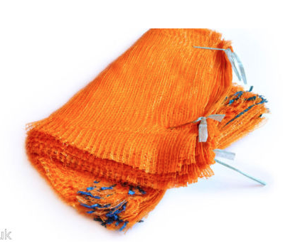
After playing with ideas as to how I will store my promotion pack. I came up with the idea to store it in vegetable bags. This provides a mesh bag that will show my design through the mesh. The vegetable bag will provide enough protection for my promotion back but also gives the concept relating to the branding for JoeSpud.


I folded the pack over to see how it would look when it was the correct size, as the pack was far to big for my A4 style publication. The A4 Page shows where the pack will be placed and how my design can be seen through the design. I need to trim up the vegetable bag to fit my design.


Once trimming my design, I need to iron the edges of the vegetable bag to seal the design and make sure that the pack can't fall out. I have tested ironing the sides to make sure they seal the design.


I experimented with starch prints by pressing potatoes onto the page and leaving them to dry. The texture provided allows an imprint of the potato but also provides a texture imprint. I will do this with some screenprint ink on my business cards and promotion back to give continuity and an interesting aesthetic. 


I designed the front page of my promotion pack. I wanted to keep the design quite simple but provide an interesting aesthetic that will catch peoples attention. The coloured shapes on the paper gives an example to the different shapes and colours that will be provided from the potato. Making each promotion back individual for a client.


Edible Business Card Experiment

I had the idea to create edible business cards. Making thin chips, applying my type or aspects of my logo to see whether a chip or "smack" (sliced fat chip) and printing onto it using food colourings allowed me to experiment with different type within food.


Making sure they are thin allows cooking time to vary from 10-15 minutes. 


I experimented with the chips and seasonings at first to see if they would taste nice and work. They proved successful and tasty so I decided to try these again but print onto them.


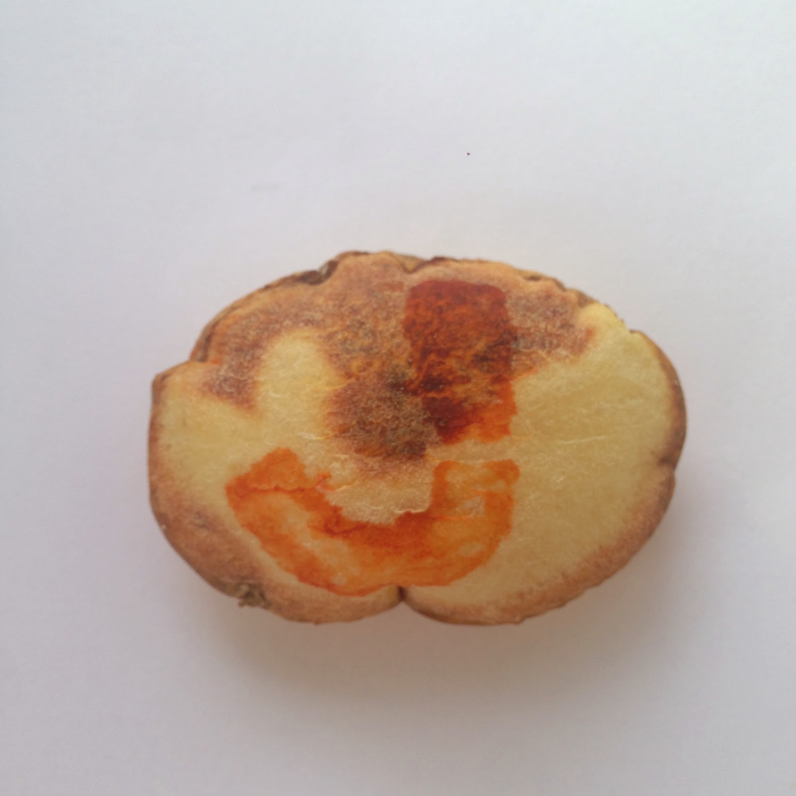
I created a print with a potato and tested them out on paper to start. The J proved successful and allows me to take this print and apply it to different formats.


Applying the print to potato slices and using food colouring allows the potato to still be edible yet giving a J cooked within the type. 


Before cooking...


After cooking...


The J proved successful when cooking the chip, it ended up being tasty. 


The potato business card is a good idea in theory however proves to be an inconvenience as they will have a short time period before going off and unedible. It could be used for promotional pictures which I intend to produce for pictures for my website and other items.


WEBSITE DEVELOPMENT

I have produced several ideas for my website. I am purchasing the domain www.JoeSpud.com to give a professional website, and one I can code myself to provide an interesting website to advertise myself and give a client a platform to view my work easily. Each idea is quite conceptual linking with the whole "spud" theme.


My website ideas are as follows: 


Sliced Potato

The sliced potato will be the main aspect to the  web page, keeping it simple and to the point. The slices of the potato will be the different links to the website allowing a simple way to navigate the sight and shows simply where to click. There will be other pages such as about, sample work, and contact details.


Potato Formats

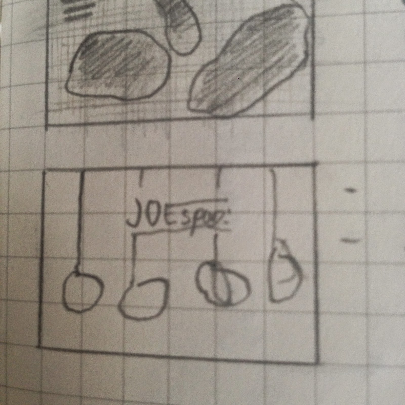
I had the idea of producing a one page website, that will go through different aspects a potato can produce, this will link with my design skills as there are a range of outcomes that can be produced but then each section of potato can be a link to the certain aspect of the sight. 


Rotatory potato

Using a rotating potato gives a slightly humorous design to the website and makes it interesting and inviting. As the potato rotates, different sections will appear within the potato to allow selection to the different aspects of the website. There will also be visible links at the side of the page for easy selection. I like the comedy value of the rotating potato.


Potato Texture

I thought about having a whole textured image as the webpage, with the same aspect of the rotating potato and using aspects of the potato texture and highlighting them to allow a clear notification of the different sections of the website and where the user should click. I like this idea but due to the fact I haven't really used a strong potato relation within my concept so the design might seem out of place using a full page spread of a potato texture. 


Potato Prints 

Using some of the prints that have been used on my business card, I will take the different aspects of my business cards and apply them onto my website. A more simple approach to display my work. 


Vegetable bag

I decided to play with the idea of using a vegetable bag texture that will relate to my promotion back, but also having different potato prints in the background to relate to my business cards, the potato aspects may be moved and altered to give a more interesting design. The website links will be in a grid in the top left of the webpage making it easy to select and navigate around the website. 


Stringed potato

Another slightly humorous website which will include hanging potatoes that will be the link to each section of the website, to make them a challenge and more interesting I might make them bounce or move to make it a challenge to click.