I had completed my layouts in Indesign and had in total 11 pages, 1 double page spread being the contents and an introduction to the book. then the other 10 double page spreads being the required information that was researched.
My Design incorporates a 3 column grid to portray my research. I chose this as the size I was doing my design (A5) the columns were able to fill these with the various research I and my fellow group has collected.
I used Helvetica neue for my typeface and used bold for titles and important aspects of my research and regular for the body copy and less important information. I used a a 9pt text for the body copy.
The top part of the page is taken up by a banner, this is a brief description to the page and gives the reader an option whether to read further on, it is a brief summary of the page.
The contents clearly shows each page title and the numbers they will be found on, then matching the layout of the contents on the other side, is a brief introduction to the booklet.


Tis

This page is an analysis of the argument whether serif is better than sans serif, the page includes a few quotes and an explanation. The say the serif and sans serif is on a different page shows the divide between the two. Serif is in a serif font, and Sans serif is in a sans serif font to show the difference, there is also a diagram explaining the difference.

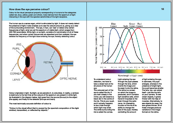
This page was layed out very simply to make sure the information is taken in as easy as possible, it is broken up into the 3 columns and allow the user to see the image, and then there eyes are lead onto the text, reading the information and then moving onto the next item.


The hierarchy page is all about type hierarchy and how it works having a section of text on the right that talks about it, on the left, is a representation of how a hierarchy can affect the way you read something, so they would realise how the hierarchy worked when reading the information.


This layout is a type classification, and allows the user to see the different genres that type gets classified, the type above the explanation is in the font that the classification is. It also says this is typography in the different classifications to give the design something people can read and interact with, meaning they will pick up the information better.


The type anatomy page is a quick introduction to the different anatomys of type, it has a few of the different meanings and a quick introduction to the different anatomys, there are more but i picked the ones I found were most important.


The pantone page is a basic explanation into what pantone colour system is, it a block of text that breaks the grid boundaries but keeps the size of the grid around the outside of the text box. The images copies the layout of the textbox.


The layout for the three colour wheel is very simple to keep simple to take the information in, it has a 2 square images on the left, then an explanation then a text box that meets half way with the images. There is a larger image on the right that takes up a big section of the page, then a text box which describes the wheel above it.


The next page is quite full with information, this is because of the subject. The pages has 2 larger images that are positioned in the right order of the information

I included a similar layout with the colour harmony page, to make it quite easy to read the amount of information there is on the page.


The effective grid system page is also text based, it is a big subject so I used the last 3 double spread pages to include a lot more information and fill the pages more than the other double page spreads.


These were my final double page spreads, there is a contents and introduction, and the 10 double page spreads. I am pleased with these designs as I believe they effectively portray my information.
No comments:
Post a Comment