During this module I found myself confused and unorganised when producing the research. I found it difficult to find a specific point to research. After compiling my research about photo manipulation I started to enjoy the developmental process of completing a publication. As I have often worked away from publications I believe this was an experimental process into the production of publications as I wanted to progress my skills and understand what steps need to be in order for a publication to work and what design decisions need to be made.
I found my research worked nicely with the publication and the content of my research ended up being the main focal point within my designs. I looked into the photo manipulation of imagery then applied this new research that I have discovered and made me understand that the public need to see this information, they need to be aware of the denial and trust that is being broken with these generated images. I picked a few genres that my publication will look into to provide scope and knowledge over a few types of manipulations.
One aspect I would like to work on for future modules would be the experimental process with my publications, I want to produce work that experiments and produces exciting new compositions that work and make readers want to keep and look after my work. I haven't produced enough publications on the course so my intentions are to work with a range of outcomes for briefs and make sure that my concept and idea is being pushed and developed the best it can. This will only be achieved with experimenting, and understanding the tricks and process it takes to produce these outcomes.
I also want to work on my layout and production of layout within a publication. I found it difficult to get effective aesthetic layouts and I believe developing on this and making sure I research further into unique and experimental layouts will promote my designs and fit with my style.
I have realised that I like to produce strange, yet clean work that entice people in and to look further into the design yet all aspects of the design become legible and readable. Producing interesting work that people are happy to read and look into, but having a strange and unique aesthetic that they haven't seen before.
Another aspect I want to look into is the time keeping and organisation. I want to make sure that I have an organized work process and my design decisions are accurate and relevant to the development and progression of my work. I want to refine an organised time plan that I will apply to briefs, and work in a structured routine to complete my briefs. I believe this module has put me in the right mindset for third year and has motivated me to question my work process and understand aspects that need to improve and aspects that aren't working.
Thursday, 21 May 2015
Covered Development
Quotes that provided Inspiration...
"The mind does its perceiving in terms of intensity of existence, profundity of significance, relationships within a pattern..."
"Our normal state of mind is continually calculating the relationships between things, measuring, and analyzing..."
"Profounder Significance"
"Spatial relationships had ceased to matter"
Huxley reported that under the influence of mescaline, Place, time and distance ceased to matter very much. Looking at his watch but realizes it exists "in another universe" because he has discovered what it means to live in a perpetual present.
My intention was to capture this "perpetual present" and show a distorted sense of reality that doesn't make much sense, but still shows the perception, and significance of the relationship between aspects of life.
I sketched up a few ideas for the front of my book cover designs with what I imagined when reading through the book. There are certain aspects that I wanted to recreate and produce for the front cover. This front cover would work with aspects of a bookshelf but distort the outcome, the significance of a bookshelf would be present but the use of negative space and the altering of colours and direction to provide a distortion.
Initial Idea: Bookshelf distortion


I decided to take some pictures within the library to capture some aspects of books within a shelf and maybe taking some of these compositions into some of my edits.


Capturing these panoramic shots give the illusion and distortion that I had imagined for the shelf. It recreates in my opinion the colour and alteration to


REDESIGN
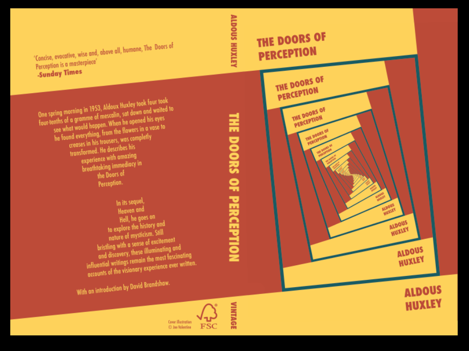
After experimenting with the bookshelf and looking into different ways of portraying a book cover within a design, I decided to experiment with the idea of creating some sort of book "inception" taking the book cover, and repeating it within itself. This concept is much stronger as I believe it questions the book further and plays with the quote "Profounder significance". With this Profounder (penetrating or entering deeply into subjects of thought or knowledge;having deep insight or understanding) significance aspect in my mind, I wanted to represent this with a repeat of the same design that leads viewers in and draws them into the book.
Second Idea: Book Repeat

With the experimentation with colour and the way it is positioned on the first repeat, will give me an interesting composition. I need to make sure that the design is obvious in the way it repeats itself.


I produced a template to show where the next repeat would go, and started to mock up various experiments to see the final outcome. After experimenting with this template, I decided to change the way the layout was positioned and give it a slight rotation.


The slight rotation provides an inward curve that provides a visual stairway into the centre of the design. It leads people into the design to represent the bookshelf that led huxley into deep contemplation.


I created my frame and colour aspects to my design in illustrator. The frame provides the negative space for the next repeat, making each rotation between the repeat accurate and gradual.

I like the layout of the type as it provides a gradual rotation that will occur when the design is repeated yet it is still readable for a good section of the repeat untill the type gets too small to read, yet the colour of the font is still present and symbolic.


This shows the final repeat. I need to finalise my colour choices and start development on a back page.
Colour Development
After designing my book cover I came to the conclusion I needed to edit and experiment with my colours and understand what will be the 2 colours, and what will be picked for the stock. Below is a gif of various colour experiments.


I started by finding some stocks that would be suitable to change and use as one of the designs. I picked colours that were already present within the design. Having the blue for the boxes that spiral inwards, and the yellow and red stock which are the steps into the spiral.


I colour matched the stocks and applied them to the design to give some sort of idea into what the design would look like with these stocks applied to the design.


I tested my design on different stocks by separating different layers and allowing stock to take certain parts of the design.


Below shows the stock with the colour printed on top.

FINAL COLOUR CHOICES
After experimenting with colour and not having much success, I decided to stay with my initial colour choice, I had no problems with this, however I realised I designed using 3 colours and forgot to leave a colour for the stock. Therefore with development, I found a stock that resembles the original yellow in my design, so using this will allow the same aesthetic as my design but with a 2 colour print with a stock as a base colour.
After experimenting with colour and not having much success, I decided to stay with my initial colour choice, I had no problems with this, however I realised I designed using 3 colours and forgot to leave a colour for the stock. Therefore with development, I found a stock that resembles the original yellow in my design, so using this will allow the same aesthetic as my design but with a 2 colour print with a stock as a base colour.

I mocked up a test to see how the design would look with the yellow as a replacement to the original to give a visual representation of what it will look like once printed. I also experimented with printing onto different stocks to understand what would work the best and which would be most successful. I found printing the orange onto the yellow was the only way to get the same aesthetic.


As I am printing on yellow stock, I need to remove each aspect of yellow that is situated within the design. Applying the magic wand to the yellow than pressing similar allows me to select all the yellow aspects and remove them giving a stencil for printing my final design onto.


This design is now ready to digitally print, with A4 cuts of my yellow stock then applying the print over the top provides the harshness of the red with a more subtle approach as the yellow tones down the design.
Back Page Development


Studio Brief 2 - Covered


Possible Book Choices
Designers Don't Read


"Austin Howe is a creative director, writer, advocate, and cheerleader for design-but not a designer. He believes “in the wonder and exuberance of someone who gets paid-by clients to do what he loves.” Howe places immense value on curiosity and passion to help designers develop a point of view, a strong voice. He explores the creative process and conceptualization, and delves into what to do when inspiration is lacking. If there’s a villain in these elegant, incisive, amusing, and inspiring essays, it’s ad agencies and marketing directors, but even villains serve a purpose and illustrate the strength of graphic design “as a system, as a way of thinking, as almost a life style.” Howe believes that advertising and design must merge, but merge with design in the leadership role. He says that designers should create for clients and not in the hope of winning awards. He believes designers should swear “a 10-year commitment to make everything we do for every client a gift.” If this sounds like the designer is the client’s factotum, not so. Howe also argues in favor of offering clients a single solution and being willing to defend a great design. Organized not only by topic, but also by how long it will take the average reader to complete each chapter, Designers Don’t Read is intended to function like a “daily devotional” for designers and busy professionals involved in branded communications at all levels. Begun as a series of weekly essays sent every Monday morning to top graphic designers, Designers Don’t Read quickly developed a passionate and widespread following. With the approximate time each chapter might take to read, Designers Don’t Read’s delight and provocation can be fit into the niches in the life of a time-challenged designer. Or it may be hard to resist reading the entire book in one sitting!"
After looking at this book and the way it explores the creative progress and conceptualization. The book has a humorous aspect to the book but also a good motivational aspect. It is also intended to function as a daily devotional for designers...
The Doors Of Perception
The Doors of Perception is a short book by Aldous Huxley, first published in 1954, detailing his experiences when taking mescaline.The book stated that the drug could be used to research the unconscious mind. Huxley had written that drugs were "toxic short cuts to self-transcendence”.
Requirements
- Two Colour print plus stock for completed designs.
- Final printed A4 poster and digital print of final completed book jacket design
- Two design boards which provide a condensed overview of your research, process and design decisions.
- Final printed A4 poster and digital print of final completed book jacket design
- Two design boards which provide a condensed overview of your research, process and design decisions.
Initial Ideas
Looking into artist research for inspiration, Aldous Huxley described his vision that represented the artwork
of Juan Gris and Braque.


Looking into artist research for inspiration, Aldous Huxley described his vision that represented the artwork
of Juan Gris and Braque.
This inspired me to create a render of the scenery that Huxley is describing, he goes into depth when
describing what he could see when under the influence, with this vivid description I could replicate
what he was seeing.
After doing some reading of the book and trying to find aspects that would inspire me. After reading
Huxley's description of his study and the depth he went into the books and his thoughts after the
mescaline, I found my main focus reflecting this aspect of his description As the link between the bookshelf
and creating a book for the brief really interested me.
I looked into abstract shapes within art one day in the library and took inspiration from different books that
reflected a bookshelf like structure or resemblance to the shapes found in book shelves.


Subscribe to:
Comments (Atom)