Thursday, 13 February 2014

Secret 7 Live Brief

For the Crit I created these 5 designs, I had a range of ideas and needed to decide where to take my design for the next part of the design. 


After the crit I resolved the fingerprint idea to produce this design below, it is a design using all the fingerprints and overlaying the same design on the top to give the feeling that there are multiple personalities. Below is the final outcome: 


I am pleased with my final design and believe it reflects the song well. I have also mocked it up into a final design into a vinyl sleeve. 


Tuesday, 4 February 2014

15 Questions

Type Design
1) Which fonts work best from far away?
2) Which fonts work best when up close?
3) Which foundry has the most fonts?
4) Which is the most expensive font to buy?
5) Who is the greatest type designer of all time?
Legibility/Readability
1) Does serifs make a difference?
2) Does the hyphenation affect the readability of body of text?
3) What is the perfect amount of line spacing?
4) Which is the easiest style to read? Bold, italic. Light or regular?
5) Is it more readable in uppercase or lowercase?
Colour
1) Which colour is best for body copy text?
2) Which colour is the most popular colour?
3) What percentage of people are completely colour blind?
4) Can florescent and UV colours be pantone matched?
5) How many colours are there in a pantone book?

Monday, 3 February 2014

Study Task 1 - Your Type Journal

After being given the on going brief by Fred to look further into type, and analyse it further by looking into different aspects of type and how it effects us day by day and the different purposes of type.

I started out my type journal by taking pictures of many different aspects of type, I intend to look further into the different categories of type and go down different paths to analyse it.

After a day trip to liverpool, I started to look at the type that is used to inform us of trains, and different locations of trains.

Below is a picture of the Merseyrail train information.


Researching further into train information, I started to look at the the font used for transport for london. As in my opinion, is the best place for transport, having the tube system in place that effectiavally transport thousands of people every day. After I looked further into the design of the font, I discovered that the font is "Johnston" that is used throughout london transport.

Features of the font include the perfect circle for the letter O and the diagonal square dot above the i. the punctuation marks are also based on the diagonal square dot. The capitals of the font are based on roman square capitals and the lower case are based on humanistic aspects of the handwriting use in Italy in the fifteenth century.


Other uses for the font includes the Tube map, Nameplates, and general station signing , as well as much of printed material that is issued by the underground ground and its successors.

I then started to look at british signs that use a specific font on the motorway and found out that there is a sans serif typeface that was first designed for road signs in the UK. It was created from 1957 and finished in 1963 by Jock Kinneir and Margaret Calvert  as part work for the department of transport and Worboys committees.

The sans serif typefaces are used to give a clear and simple font that can be read and understood quickly. Sans serif typefaces are also used on the emergency signs that are used on the train that I also saw.


These emergency signs look official and are used for ease of reading, they are quick and too the point, they stand out from the rest of the text as they have a red background to symbolise danger and then the font is clear and precise so anyone in a rush can instantly read it.

Below are some General instructions, You can clearly tell this font isn't official warnings as the font isn't the same as the official signs. These warnings have a bold and chunky feel to them, and make them almost not official, meaning people may just ignore them, as they are not official notifications.


They have a bold font to try to get people to read them, however as this font is so different to the official ones, I believe the impact is lost. 


I then noticed these signs, There is firstly a Caution, in a much larger scale than the actual message, this Caution would be used to capture the attention of the viewer. The uneven floor is in a much smaller type than the caution meaning it is less impacting and people could actually just ignore it, Once they see the caution they could actually just watch where they are stepping without looking at the fact there is an uneven floor. 

There is also a bold sans serif font underneath that reads please keep your feet off the seats, It is a bold uppercase font that is used to give the meaning of importance. I looked into warning signs and they all include this bold sans serif font, with an uppercase message with the yellow background to capture your attention. I believe people will instantly see the colour and realise that it is a warning sign.


The warning signs above show the same style and typeface to warn people about different things, however they all include the same font to do this. 


Below is a sign I saw trying to advertise a new house in the south of liverpool. The typeface used is a light font followed then a regular font underneath, the  font is relaxed and suggests that it is a helpful and relaxed company, making the phone number seem more relaxed and easy to call.  


When having a meal in TGI's, I saw this book, it contains 6 different typefaces that work together to create a range of types to suggest the shop has a range of foods, with different styles, there are italian pieces that are in italic, to further the idea of the dish being italic, and the american food are in a big bold font to suggest a big bold dish that is strongly american based. 

The Guardian has been an icon of newspaper design since David Hillman's radical redesign
 in 1988. In 2003, the management decided it was time for another drastic change, from 
broadsheet to the smaller Berliner size


Above is a hand written font from Mr.Bingo, he creates hand rendered types to create this happy aesthetic feel to the design.


Spotting this frame type whilst going through a shop, I noticed it was a serif font, the serif font is seen as quite formal and suits the style the company is going for, it portrays a elegant company and shows the company to be more formal, rather than using a sans serif font, as it would make the company quality look less formal.


Colour Theory

After going through the powerpoint that fred gave us, I picked up many different aspects of colour that I didn't know before the lecture.

Starting out what the energy and wavelengths are for colour, and how different amount of energy can affect the different colour.


Fred then explained how colour actually works and how our eyes pick up the different colours. This is shown below with a slide that fred showed in the powerpoint.


We then moved on to the different colour wheels and looked into different primary, complementary and colours that are in the colour wheel. 


we then looked at 7 aspects of colour and how they work:

Contrast of TONE

Contrast of HUE

Contrast of SATURATION
Contrast of EXTENSION

Contrast of TEMPERATURE

COMPLEMENTARY contrast
SIMULTANEOUS contrast
We then had an exercise of matching a colour object with its pantone colour, and then matching the background to its pantone colour and placing the object on top, to see if the colour changes with a different background.


I started off matching the colour with the pantone colour in the booklet of pantone colours


Then I matched the objects with the colour with a pantone matcher then started to compare the objects to the back ground 


This shows all 4 objects together:


There is a contrast in saturation here as the lighter oranged paper makes the orange pen stand out more.


There is a slight contrast of hue, saturation and tonal however none are massive contrasts. 


There is a temperature contrast here so the orange stands out a lot more with the light yellow temperature behind.


There is a contrast in tone and extension as they are on opposite ends of the colour wheel.


There is a slight temperature and tonal contrast in place. 


There is a slight contrast between saturation, hue and tone however none are particularly big contracts


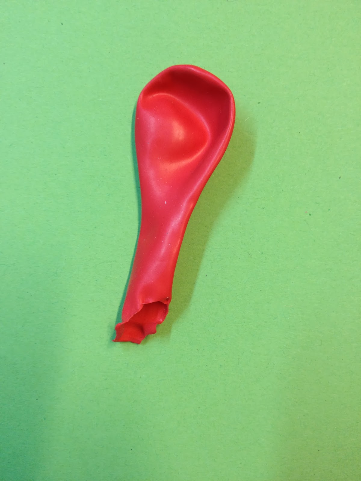
A contrast of saturation makes this red balloon look a lot reader. 


There is a contrast of tone as the yellow is much lighter than the red balloon. 


This combination is a complementary contrast, Green and red are opposite on the colour wheel. The contrast of extension also makes the red balloon more prominent as it is taking up a small part of the image.


This contrast in temperature as the blue and red are different on the temperature scale, there is also a slight hue contrast on show. 


In this there is a high contrast of hue, with a slight contrast of tone.

This tone is quite similar to the bobble and the paper, the main contrast would then be the hue.


This is a complementary contrast and a contrast of tone

The colours have a contrast of hue but the tone is similar


There is a massive contrast in hue in the photo, and a slight contrast of tone


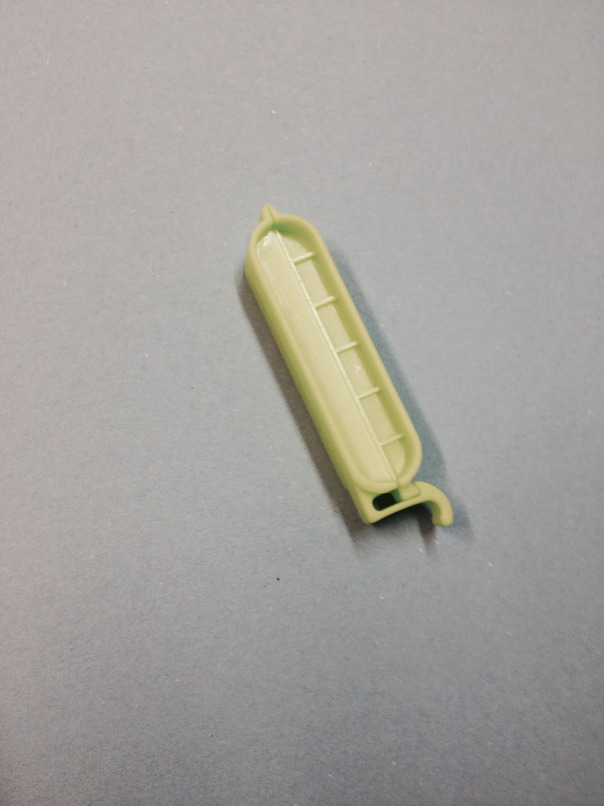
The main contrasts are tone and saturation, the light paper is a massive difference to the bright clipper. The photo of this doesn't really show the contrast that was in person due to the lighting levels that were difficult to capture. 


There is a contrast in tone and extension as they are on opposite ends of the colour wheel.


There is a complementary contrast with green and red, as well as a slight contrast of tone.


The tonal contrast here was big however due to lighting it was unable to capture this.


There is a contrast of saturation, tone, and hue, working so this creates a pretty strong contrast.

I then used a pantone colour website to find out the specific colour of the objects and paper that I used to make a photoshop mock up of my results to see if they would change anything that I saw on the day.


With the pantone colours I then created this. I used 5 long rectangles to represent the 5 different stocks I used, then each block has the 4 objects inside however they are now just rectangles.


After looking at these results I believe that none of these results from the day would change as they all represent what type of contrast it was on the day, It is a good way to look back and maybe different results would have occurred with different lighting, however I believe my results were accurate.