After going through the powerpoint that fred gave us, I picked up many different aspects of colour that I didn't know before the lecture.
Starting out what the energy and wavelengths are for colour, and how different amount of energy can affect the different colour.

Fred then explained how colour actually works and how our eyes pick up the different colours. This is shown below with a slide that fred showed in the powerpoint.


We then moved on to the different colour wheels and looked into different primary, complementary and colours that are in the colour wheel.


we then looked at 7 aspects of colour and how they work:
Contrast of TONE

Contrast of HUE

Contrast of SATURATION

Contrast of EXTENSION

Contrast of TEMPERATURE

COMPLEMENTARY contrast

SIMULTANEOUS contrast

We then had an exercise of matching a colour object with its pantone colour, and then matching the background to its pantone colour and placing the object on top, to see if the colour changes with a different background.

I started off matching the colour with the pantone colour in the booklet of pantone colours


Then I matched the objects with the colour with a pantone matcher then started to compare the objects to the back ground


This shows all 4 objects together:


There is a contrast in saturation here as the lighter oranged paper makes the orange pen stand out more.

There is a slight contrast of hue, saturation and tonal however none are massive contrasts.

There is a temperature contrast here so the orange stands out a lot more with the light yellow temperature behind.

There is a contrast in tone and extension as they are on opposite ends of the colour wheel.

There is a slight temperature and tonal contrast in place.


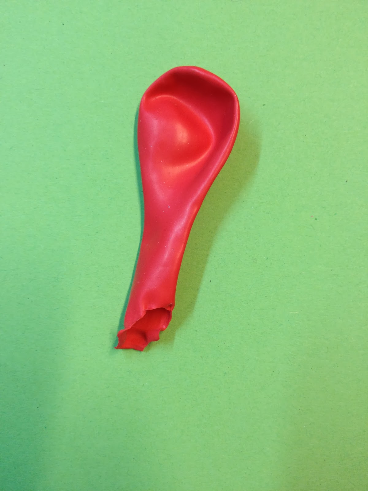
A contrast of saturation makes this red balloon look a lot reader.

There is a contrast of tone as the yellow is much lighter than the red balloon.

This contrast in temperature as the blue and red are different on the temperature scale, there is also a slight hue contrast on show.

In this there is a high contrast of hue, with a slight contrast of tone.

This tone is quite similar to the bobble and the paper, the main contrast would then be the hue.


The colours have a contrast of hue but the tone is similar

There is a massive contrast in hue in the photo, and a slight contrast of tone

The main contrasts are tone and saturation, the light paper is a massive difference to the bright clipper. The photo of this doesn't really show the contrast that was in person due to the lighting levels that were difficult to capture.

There is a contrast in tone and extension as they are on opposite ends of the colour wheel.

There is a complementary contrast with green and red, as well as a slight contrast of tone.

I then used a pantone colour website to find out the specific colour of the objects and paper that I used to make a photoshop mock up of my results to see if they would change anything that I saw on the day.


After looking at these results I believe that none of these results from the day would change as they all represent what type of contrast it was on the day, It is a good way to look back and maybe different results would have occurred with different lighting, however I believe my results were accurate.
No comments:
Post a Comment