News Paper
Below is my first Type Hierarchy experiment, It is a news story from the sun which includes a big advertisement and then the story above the advert.
This is the image of the page before alterations:

I started off removing the advertisement, because I believe this is what caught my attention the most, It is a big bold font that has an image behind so it makes it stand out a lot more from the simple text and headers. I removed this and placed it at the top of the hierarchy.

This led me to look into the story, and which part of the story actually stood out the most, I believe that the header actually stood out more than anything else, so i then removed it and added it onto the page


This shows the order so far.

Looking back at the page, I looked into how the imagery now catches your attention, The header has gone so we know what the story is about, now our eyes are taken to the image to link further to the story and makes us get a good understanding of the story before we read the body of text. So I then removed the imagery and then added it to the hierarchy.


This shows the two images that are now added to the order, The text imagery is added first because it has various text and information that is able to be read and taken in, this would stand out more than the image, so the viewer would look at the information then look at the image.

This is what I am left with after removing the imagery, The next item that stands out more is the coloured header about the block of text on the left.


I then looked at what was left and realised that the right body of text would then be the next thing that consumer would read.


Then the last thing that was left was the various items of the newspaper. It is where people go to the next pages or find specific information.

I added this to the hierarchy, This hierarchy works well as it clearly shows the order of eye contact with the page, starting off with the advert, then the headers, moving round to the images, then moving onto the body of texts, then moving onto the place where you go next.

Newspaper 2
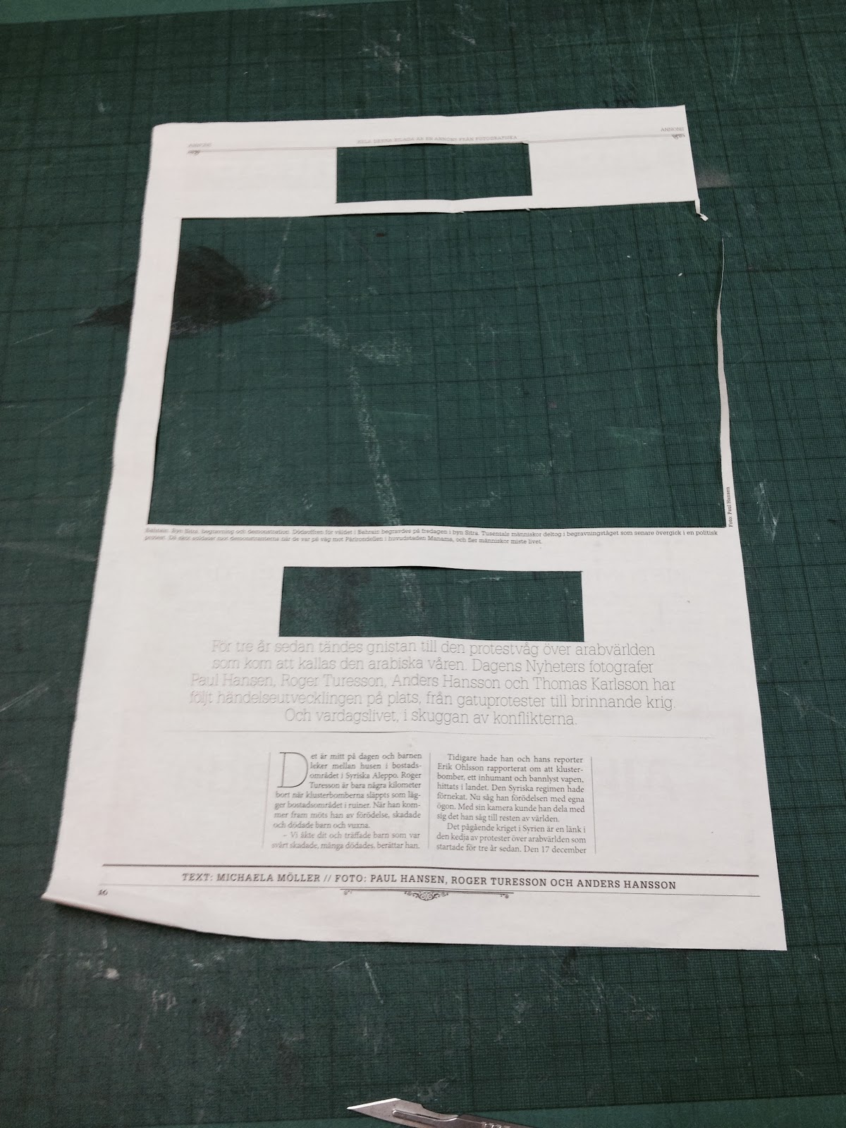
This was the initial Page, It includes a header at the top, then a big image at the top, then the title and body copy is underneath this. It is a scandinavian newspaper so has a different format to traditional english newspapers, below is the step by step hierarchy analysis I did on this magazine.

I firstly removed the image to make the type hierarchy analysis a lot easier, as the image was the biggest thing on the page so I removed it to make the analysis of type much easier.

I then realised the thing that stood out the most on the page was the type in the middle of the page, the big sans serif font stood out from the page as it was central and my eyes got drawn towards it. So I added that to the top of the hierarchy.

Then looking at the page layout again my eyes were drawn towards the top of the page as the layout had a title at the top of the page describing what was on the page,

I added this to the hierarchy.

Then the layout was quite minimal at this moment so I believe the next item which struck my attention was the big body of text that was underneath the title, it was slightly italic making it interesting and drew people in to read it further.

I then looked into my layout again and found that the body of text including the story was the next item for the hierarchy. The D in the text was made a lot larger in the body to show where the start was so I added this first.


Looking into the layout again I then realised the little footer line of text was where our eyes would be led next, so I then added this to the hierarchy.


Newspaper 3
This is the third news story, It is a news story from the guardian and includes the story and the big advertisement at the bottom of the page. I firstly removed the advertisement to make it basically about the news story to see how them designs would work.

I then looked at the story and found that the image was the most distracting thing on the page so removing this would allow the type hierarchy to be more fair.

After removing the image I saw that the National stood out as it was bold and in the top left where we start to read, It will stand out from the rest of the text as it was the boldest thing on the page


I removed the Title for the page then looked what was next, There are two other sub headings to the stories as there are 2 stores on this page, I removed the left story first, as this was the first thing you would read.


Then the bold author was removed as the title leads on to the story.

This then lead on to the actual story of the main body of text, I removed this as it is the way you would read round the page.

removing the first column then moving onto the next columns of the story.


This shows the layout of the story laid out in order, giving each step I created and having the different story in order depending on what was most important.

Magazine 1
This magazine article from vice has a quite simple design, Having a title, 2 images, and then the body text surrounding the images.

I firstly removed the image as this was the biggest and as it is a face, instantly try to make eye contact with the eyes of the face.


I then added these two images on the hierarchy as these were the initial things that stood out to me.

After looking at the layout now, the title was the main thing that caught people's attention. It was a bold title and much bolder than the body text.


There was then a little sentence underneath the title which was bigger than the body text and it was much larger than the body text so it caught my attention the most.


There was then a quote what was on its own at the side of the body copy text so that this made this small quote stand out much more than the body text, meaning it is more important to read first then the body text.

After adding all these little parts to the body copy text, it was now ready for the body copy texts, so I started out column by column leading up to the last column.


After finishing adding the columns to the hierarchy, there was a small quote in the middle of the page that was more important than the page number, so this was added first.


MAGAZINE 2
I started out taking the title out, this was the most important part of the text, it stood out with its bold italic font and the text stood out from the design.

There was then a bold section of text at the beginning of the body section, I chose this as it was at the beginning of the body copy so it stood out a lot more.


Then the body copy text will be added to the hierarchy


there were then some little annotations including author and page number that needed added.


This then shows the order of the hierarchy as I believe the customer would have read through the design.
This magazine entry had a big section for the title, then a 2 column body copy text, and then a big image with a central text.

I started off removing the text that was spread across a good section of the design, It is bold and black which instantly jumps out the page. It takes up a good top section of the page meaning it stands out a lot more.

I then removed the text that was inside the image, It stands out because it is a single word inside the image with a nice white colour forcing it to stand out with a dark background.

I then removed the section of the text that was on its own next to the body copy of text, It stands out from the body copy as its on its own and includes various bold words which make it look more obvious.

I then removed the body copy text as it is where your eyes lead from reading the little paragraph.

Then the page number needed to be added to the hierarchy as this is where the consumer looks last.

This shows the layout of the design hierarchy.

Websites
Designspiration
I picked the designspiration website for its simple yet effective layout. It has the name of the website in the top left of the page, then a list or links on the left, then a search bar at the top.

The first thing that I picked to go in the hierarchy is the name of the website, it stands out a lot more than the rest of the information as it is bold and in the top left corner.


I have then placed the top search bar, as they would instantly jump from reading the links, to going up to the search bar and using the search bar if they need to.

http://www.vgrafiks.com/
This website was interesting as it has lots of different levels of type. I picked an order for the hierarchy that shows what a consumers eyes would go through.

They would instantly read this big bold title that hits them when they open the page.


They are then lead to the body copy text that is placed under the italic text.

There eyes will then jump up to the top section as they will use this to find which section to go to next.

Reading both the title for the website and what the brand is then the different sections to the page.

They will then be led to the text that is in the bottom right of the page, completing their eyes looking round the page and finding this handwritten handwriting that is place with the image.

http://premiumdraught.com/
This simple yet effective design leeds your eyes down the page to read the required information in order.

It starts out with the title and then leads with this big bold font that reads PREMIUM DRAUGHT, it is bold and capitalised with a nice colour that stands out thus making it most important.
It then reads down to from the title to the line underneath that informs the consumers what the title means. It is also in a different colour thus making it stand out when finishing reading the title
After reading the title and strap line it leads the consumers eyes down from there and makes them read both the address of the company, then the opening times and contact numbers.

After reading the contact information then having no where else to go, there eyes are taken to the top of the image which allows them to select where to go next. giving them somewhere else to go and somewhere to read.
I have found this exercise important as it is a very clever way of making the consumer read certain parts of the page first, It allows the consumer an easy read with a well designed layout and allows people to take in the right information, and even possibly hiding some information that isn't as important to the consumer when reading, however still needs to be included.
No comments:
Post a Comment