Saturday, 18 October 2014

Mock Up

I created this design to display the both variations of my logo. The logo would be used on promotional items, and actually advertising the exhibition. So I intend to produce mock ups showing the exhibition and how my logo would be used within to brand the exhibition. 

Below gives a quick branding for the exhibition, Including colours, a brief explanation, the 2 variations of the logo, depending on the shade of the piece the logo is being placed on. 


I believe the logo is simple to bring more attention to the actual photos within the exhibition.  


Crit

This was the design I produced for the crit. I was pleased with this after creating it in 2 days with research. I put this to the crit and expected the outcome. 

People said it looked almost like a night out logo, how nightclubs design and resembles a nightclub to them. I decided that this needed changing.


After having feedback for my design, I believe I have captured some resemblance to some electro and some other nights that are seen to get the freshers in. It uses this geometric style cuts with a range of colours to give out a night club style design. 


Research and Idea

So finding the right brief on kickstarter, I can now go on to look at research, and start generating some ideas to see where I end up. The research I looked into represents a similar link to an underwater theme.


The project explains how it looks at water, light, and shadows. This gave me ideas to look into geometric patterns that show shadow and light. 


I like this composition below that shows the gradient of light and reflects a circle using these gradients. 


I also like the way these triangles, make up the outer shape. 


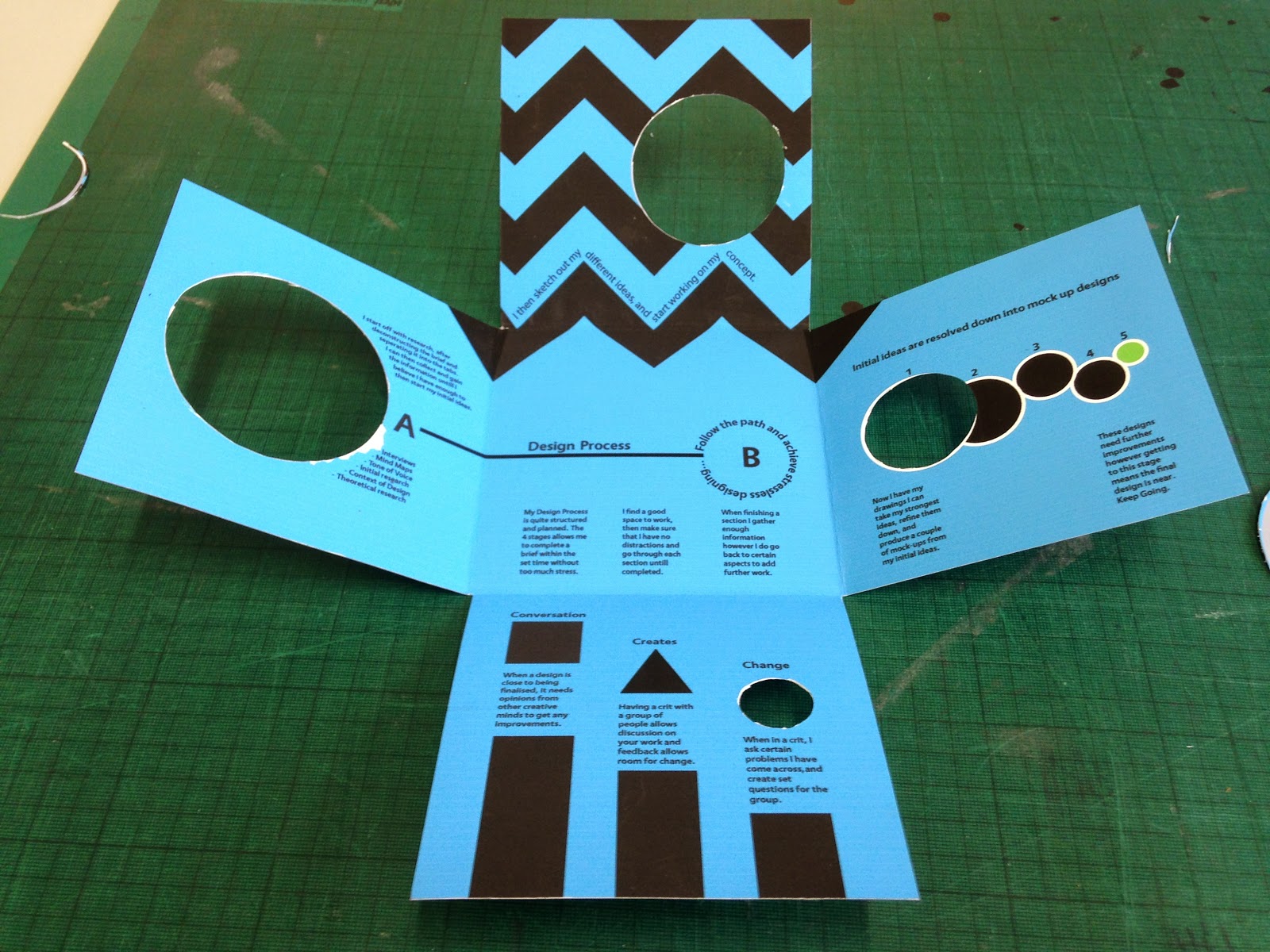
This shows my notebook that I have sketched everything I needed to, I worked with different ideas, sketches and initial ideas so I had a range of experiments before moving onto the next idea. Just throwing down quick ideas, sketches and what I have in my mind allows me to get a range of designs down quickly and work with them. It doesnt matter if they look rubbish, there quick, easy, and a simple way of getting loads of ideas down on the page.


Above shows a thumbnail how the type would work on an exhibition leaflet, I need to consider how my logo will work when creating it, and how my logo will be used. 


Testing out different shapes allows the logo to be experimented with and have a vast amount of shapes before refinining it down to the final design 


This shape really interested me, almost using negative space however having the original shape as well, to give a symbolic meaning of dripping.


I also mocked up this design, which allowed a colour scheme to be implemented in the different sections of the design. 


This was an experiment with reflection and having a 


Further experiments using


I began to experiment with a simple, more to the point type of logo, instead of having a logo with a range of lines and distractions, I decided to test out whether a design that is simple, will be more effective. Below are the experiments: 


Digital experiments for reflection and distortion. 


Mock up for the crit: design was using the original geometric style logo with a colour scheme to symbolise a wave. 


I then started to mix ideas to see how that would look, but realising that the simple line vector logo would be more accessible and allow a range of outcomes, I decided to go with this.  


Liquid

Finding this project on kickstarter really interested me. The underwater photography exhibition allows range for experimentation and a range of designs. It interests me as working with photography and light allows a range of outcomes that will be interesting. I also wanted to work with an exhibition as I could be running one next year or in the near future so this is good experience.


'An underwater photography exhibition that captures the interplay between water, light, shadows and the female form.'
"Liquid Project is an underwater photography exhibition that captures the interplay between water, light, shadows and the female form. Also, the freedom and joy that I experience while submerged in it.
For the first time I have been offered to have a solo exhibition at a beautiful gallery in Manhattan called Splashlight Studios (also called North Hall Gallery). This is a dream come true for me, but also is a big challenge to put together an exhibition like this on my own.  
Through my artwork, I aim to give visual form to this magical light-infused world, where muted sound, sense of weightlessness and mesmerizing light take me to an energized meditative state. My creative process involves the manipulation of the interplay between light and shadows, water and form. The result is an always unique design in patterns of refracted light.  Being so influenced by the fashion world and having designed women’s wear, has given me an appreciation for the female form, which plays a big part in my art. I love to photograph women because its a similar representation of how I feel when I am in water"

After reading this paragraph written for the exhibition, some words really captured my imagination and made me excited to start. Words like light, shadow, water and form give me inspiration to actually do this project. 

Refractions 1

Underwater OM

"I believe that an image is not complete until you show and share it, but It has been a challenge to show my artistic photography to the world. This is a unique opportunity for me that doesn't happen every day to an artist.

The challenge of putting a show together with the additional cost of the opening are high so I am asking for funding in this exciting endeavor."
Reflections in clear water

Liquid Desert

Studio Brief 2 - Logostarter

After finishing the first brief I am now back on track with my work process. I feel as if I am back in the routine of working and receiving this new brief allows me to carry on with my designing. I have looked through the brief and believe this is a very good brief to start. Understanding logos and manipulation allows me to brand companies. 


I need to do some research into logo design, and get initial ideas in my mind. However the first step to this brief is picking a project of kickstarter and making sure the company is relevant and suitable for a logo. I also need to get research about brand considerations that can be created for a company that I pick and how I can fit my logo into it. 

Evaluation

When first receiving this brief I struggled to get any ideas, we were creating a leaflet, using our own design process, about design process. I found it difficult to put my design process into writing, and actually explain how I produce work and the steps I take to producing a final design. After producing A3 sheets with different steps to my production, it became easy to separate my work method into 4 different categories. This made it easier to understand the amount of space needed for my design, how many folds it should have to include the different sections and start forming initial ideas.
I printed my design in digital print which cost £3.00 for an A2 Print. The stock was white and I actually printed the background colour of the leaflet onto the white stock. This caused problems when cutting the sections of the leaflet away as the design ripped and the die cutter ended up tearing the paper slightly causing some of the ink to rip away, leaving the design to look tacky and completely unprofessional. I should have considered stock and the colour scheme before as I ended up completing my design with a colour scheme I liked, I had no way of changing it as the brief was a week long. If I was to do this brief again I would definitely experiment printing with with stock and using the die cutter to see which worked best with inks and cutting from the paper.
One problem I discovered when designing was keeping alignment and making sure the folds and the design work together when folded. I found it quite difficult to match up, and make sure that each section worked with the previous one using the fold lines. The easiest way I found to make sure everything was matched up was folding the leaflet to the final design then measuring the design, then taking these measurements then applying them to my design on illustrator to make sure what I wanted, was designed on screen. This worked quite well however I believe that actually scanning in my mock up would have allowed a more accurate way of doing this, but I will try this in a new project to see if it makes a difference.
If I had more time on this brief I would have experimented with finishes, and different print methods to give my leaflet more stability and produce something that would last. However this would end up costing the design a lot more and end up taking a lot of time to experiment, and as the brief was a week long, I kept it as improved as I could for the time frame.
I like the design I produced, It includes different aspects of my design process and reflects my work process well. the design works both folded, and when flattened to give a 5 sectioned piece that draws people in. The design leads your eyes round each section before getting to the middle of the design. Therefore sticking to the concept of getting from A-B without any distractions.

Final Design Printed

This was my final printed design, the leaflet is not finished however the design is. Below are pictures showing the design and how the leaflet works together. I am pleased with this design however the printing error annoyed me, having to print the design again on coloured stock. However the design works well together and will work easily when printed onto coloured stock. 


I

Problems

I printed my design in digital print, using the stock matt paper, and printing my design over the top. This proved to be a problem as the die cutter I was using tore away some of the paper. When using the die cutter it didn't feel right going through the cut. I believe this would be a lot better using a coloured stock and printing my design on top of this. 


After some testing cutting through different stocks I found out that it was better to cut through the coloured stock instead of printing the colour on top. The print quality of the design wasn't the best either, so having a coloured stock instead, will allow my design to have a crisp and sharp look to it which would allow a much more professional leaflet. 

Mock ups

After doing my drawings and creating my initial drawings, I can now move on to mocking up some initial ideas to create a mock up version. I believe creating this mockup is a big step to a finished design, as a crit will also give me some sort of feedback for my designs and what needs changing.

I printed out different test versions to make sure the alignments matched up together and worked as a design. Below are the print out tests lined up next to each other to show progress. 


These are not the final piece they are just quick and simple mock ups to test out whether the design will work. I had to look into this to make sure I had a good and working layout before paying to print it.


Information for leaflet

I need content for my leaflet so I decided to take the information from both the mind map I created, and writing up the order of my design process. Below are the steps I take: 

1. Background research 

2. Initial Ideas and Thumbnails 

3. Refine Ideas and mock up designs 

4. Crits + improvements 


Practical Experiments (Study Task 2)

After completing the research for leaflets I decided to look into creating some folds myself to see where these ideas take me, I like some of these however I had one practical experiment that I really liked. 


This practical experiment has an interactive aspect to this design, it allows the user to find the B in the design. I like this idea I am working with at the moment. The concept is all about getting from A-B and the paths you take getting to B. I Like the way that B has been found which in theory, would be the final design. 


I think I will take this design further and see where it ends up. I believe it is the strongest design I have and I will enjoy working with this.