'Why should I collaborate?'
I believe it is important for me to collaborate as I would like to have the whole experience of completing a brief, and actually taking leadership of a brief together, and producing a response that we have had worked on together, and lead the way we wanted to. It allows us to experiment further, and plan our work effectively assigning certain jobs to make the workflow as smooth as possible.
'Who will I work with?'
I will be working with Elliot (one of my housemates so contact can be kept everyday as we live in the same house). Elliot is doing architecture at Leeds Beckett. I have always been interested in his work when looking through his design sheets and various models he has made, which worked out well when I found out we was doing a collaborative brief. We have always mentioned how it would be good to work on a brief together, so when I found out a brief could be worked into both our university work, I was excited to start.
'What brief will we choose?'
After sitting down and going through each brief from the website. There were a couple that stood out for us. ID magazine wanted us to produce something that looks into subcultures and why they are important, however after both looking on the ID website, we didn't like the ethos of the site, and both understood that it wasn't the style of design that we would be comfortable going producing work for.
We then looked at the Pantone brief, and instantly warmed to the brief, As we have 2 subjects working together, it allows the format of our designs to take completely different formats. Working with models, sculptures and renders allows the brief to be explored in a completely different way. As the brief is to brand your own town, we will be taking Leeds as our hometown, figuring it would be easier to get resources, source images, and easier for us both as we both live in Leeds.
'What do I need to submit?'
'How will I be assessed?' -
Blogging both my own work, and the group work we produce, allows my to answer the requirements of the brief and make sure that it is clearly obvious to the aspects that I produce, and the aspects that are decided as a group. It allows me to understand the importance of organisation, and actually splitting tasks up and deciding as a group who will do what in the design process. This will create a smooth workflow without getting confused as to who needs to do what. It also helps that me and Elliot will be keeping in contact a lot throughout the brief so decisions can be made easier and quicker.
Brief


Plan
As I am working with Elliot, it is important to split the work up, plan, and organise the workload to make the process as smooth as possible. Creating this plan allows me and elliot to understand the different aspects that need to be created, and keeps the design process organised and on target.
Leeds based research needs to be present, the different locations we intend to include within our branding.
Colour schemes already present. Looking at some branding that cities already include, and why, gives me and elliot an idea to the direction for the colour and design.
RESEARCH
City Branding
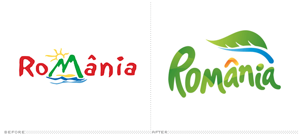
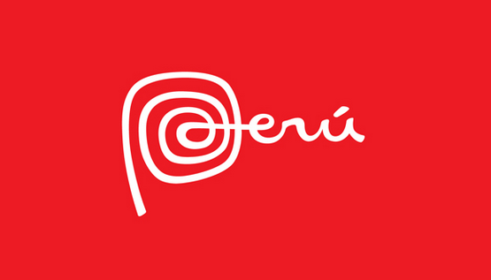
To start initial research, we decided it was best to look at some branding within cities, and how the city is reflected through the branding, and I will look at how a city is reflected, and whether the branding is successful to give a positive reflection of the city.
Romania


Peru


Melbourne


 DEVELOPMENT


INITIAL IDEAS
Our initial concept is to split leeds into 4 genres. These genres are what makes leeds interesting, exciting, and inviting for people to visit and enjoy. The categories will be split up into, Education, Retail, Art and Music.
Each section will be given its own "branding" as of such, which will be incorporated into a logo to allow the consumers understanding that leeds is a collection of these genres and show a range of exciting options.
The brand will have a clean, geometric style design allowing a aesthetically modern logo, created from abstract imagery and shapes that represent the genre of the section. This abstract will allow freedom to create exciting, new shapes that will stand out within leeds. In addition, the geometric style that was given to the branding, will be implemented into some structures, and installations that will be placed within the required section.
The colour will be separated into these 4 sections producing 4 different colour zones, however there will be a 5th colour that will represent an underlying colour that will capture and bring each coloured section together. The base colour will also act as a way of making leeds more interesting, applying more colour and making it an exciting atmosphere.
We split Leeds up into different genres to allow branding and identity for each genre. Splitting it up into different means of entertainment and making Leeds more exciting.
Education
We both decided that education is a massive aspect of Leeds. Students making up a big section of the community, and making sure that we could make this aspect interesting and relevant to the consumers of leeds.
Within the logo, we decided to look into the structured, motivated drive that the education within Leeds provides for the students. A way to reflect this would be a organised, linear type design that would reflect this education system.
We sketched up some abstract ways to reflect this feeling we both received and decided to work on this for one aspect of the logo.


LOGO
I started development on the logo. As we had sections already designated, we had certain shapes that needed to symbolise certain sections. The sections requiring designs for are as follows:
Education
Art
Retail
Music


MUSIC


COMBINATION
This is the final logo which includes a combination of each section working together as a logo. The 4 sections each have an individual pantone swatch which will brand that section as an individual zone to Leeds.


PICKING THE COLOURS
ART


 MUSIC
MUSIC


STRUCTURES
As I was completing the logo and picking the colours for the pantone colour scheme, elliot produced these renders using sketch up then applying them to real life scenarios to show how they would work.
ART STRUCTURE - A space for exhibitions and upcoming artists that will promote and display new pieces of art within a small structure situated near the gallery. It allows a way of promoting and getting the public involved with the art scene in leeds.
Windows including in the design will be in the pantone colour that is situated on the logo for the art section.


'What do I need to submit?'
'How will I be assessed?' -
Blogging both my own work, and the group work we produce, allows my to answer the requirements of the brief and make sure that it is clearly obvious to the aspects that I produce, and the aspects that are decided as a group. It allows me to understand the importance of organisation, and actually splitting tasks up and deciding as a group who will do what in the design process. This will create a smooth workflow without getting confused as to who needs to do what. It also helps that me and Elliot will be keeping in contact a lot throughout the brief so decisions can be made easier and quicker.
Brief
This brief is perfect as it allows the skills provided from both our degrees. The use of graphic design, and architecture can be linked and combined to create an interesting outcome for this brief. As the brief is branding a home town through the language of colour. This holds no barriers to the possible outcomes we can create and using both skill sets allows us to produce different and interesting outcomes to the brief.
The branding will be seen by everyone who is a part of leeds. Everyone will see the design so it needs to relate, adopt and create an experience for the public as they are the ones who will see, and the branding represents where they live so the public needs to relate and understand the colour scheme.
As I am working with Elliot, it is important to split the work up, plan, and organise the workload to make the process as smooth as possible. Creating this plan allows me and elliot to understand the different aspects that need to be created, and keeps the design process organised and on target.
Leeds based research needs to be present, the different locations we intend to include within our branding.
Colour schemes already present. Looking at some branding that cities already include, and why, gives me and elliot an idea to the direction for the colour and design.
RESEARCH
City Branding
To start initial research, we decided it was best to look at some branding within cities, and how the city is reflected through the branding, and I will look at how a city is reflected, and whether the branding is successful to give a positive reflection of the city.
Romania
Peru
Melbourne
Singapore
INITIAL IDEAS
Our initial concept is to split leeds into 4 genres. These genres are what makes leeds interesting, exciting, and inviting for people to visit and enjoy. The categories will be split up into, Education, Retail, Art and Music.
Each section will be given its own "branding" as of such, which will be incorporated into a logo to allow the consumers understanding that leeds is a collection of these genres and show a range of exciting options.
The brand will have a clean, geometric style design allowing a aesthetically modern logo, created from abstract imagery and shapes that represent the genre of the section. This abstract will allow freedom to create exciting, new shapes that will stand out within leeds. In addition, the geometric style that was given to the branding, will be implemented into some structures, and installations that will be placed within the required section.
The colour will be separated into these 4 sections producing 4 different colour zones, however there will be a 5th colour that will represent an underlying colour that will capture and bring each coloured section together. The base colour will also act as a way of making leeds more interesting, applying more colour and making it an exciting atmosphere.
We split Leeds up into different genres to allow branding and identity for each genre. Splitting it up into different means of entertainment and making Leeds more exciting.
Education
We both decided that education is a massive aspect of Leeds. Students making up a big section of the community, and making sure that we could make this aspect interesting and relevant to the consumers of leeds.
Within the logo, we decided to look into the structured, motivated drive that the education within Leeds provides for the students. A way to reflect this would be a organised, linear type design that would reflect this education system.
We sketched up some abstract ways to reflect this feeling we both received and decided to work on this for one aspect of the logo.
I started development on the logo. As we had sections already designated, we had certain shapes that needed to symbolise certain sections. The sections requiring designs for are as follows:
Education
Art
Retail
Music
EDUCATION
ART
RETAIL
This is the final logo which includes a combination of each section working together as a logo. The 4 sections each have an individual pantone swatch which will brand that section as an individual zone to Leeds.
PANTONE COLOURS
PICKING THE COLOURS
ART
EDUCATION
RETAIL
STRUCTURES
As I was completing the logo and picking the colours for the pantone colour scheme, elliot produced these renders using sketch up then applying them to real life scenarios to show how they would work.
ART STRUCTURE - A space for exhibitions and upcoming artists that will promote and display new pieces of art within a small structure situated near the gallery. It allows a way of promoting and getting the public involved with the art scene in leeds.
Windows including in the design will be in the pantone colour that is situated on the logo for the art section.
MUSIC STRUCTURE - A stage with various seats and places to proform allows users to interact, play, have fun with a built stage within the music area. The seats provided will be in the Music pantone colour.
EDUCATION STRUCTURE - The education structure will provide a connecting point, providing students with a place to work, see, communicate and enjoy. A work zone which will allow students to work in a relaxed atmosphere surrounded by other students.
RETAIL STRUCTURE - The retail structure will include a cat walk which will allow users to interact, take pictures, and have fun, but along side the catwork, includes a space for advertising for various shops, allowing mirrors, different promotional items for that season, and a whole section for new retail advertising within the retail area.
No comments:
Post a Comment