Monday, 16 February 2015

Establishing a practical response

Technique

Advertising within a new media advertising environment, the means and methods used to capture peoples attention within the media using innovative means of advertising. New means such as youtube adverts, banner advertising for websites, pop up, avoiding traditional means such as print adverts, zine advertising and producing a more interactive method of advertising. I want to take traditional techniques, designs, and a more sophisticated way of advertising, and apply it to new, interactive mediums to create a innovative means of communication, In addition, I would like to take methods of new media interactive advertising, incorporate concepts, and apply them to traditional means of advertising and compare the two outcomes to see which becomes more effective. 

Content 

Establishing a company that has been through the stages of traditional, and the conversion to new media means. Content will be a new product, or a product that is receiving more attention for advertising. The reason for picking a product over picking a company to advertise is because the company will have enough advertising as it is a big company, and a specific product will need advertising more. 

Communication 

Communication will be informative and persuasive to get a new customer to purchase a product from the company. The advertising methods will vary depending on the outcome of the traditional means, or the new advertising means. The communication will be two different resolutions as we are comparing two means of advertising, so the outcome will be different for each method. 

Research/analysis 

Research will consist of separating the methods of advertising, picking the best examples of traditional means of advertising, taking the best methods of new media advertising, and swapping the methods, to see whether incorporating the traditional means of advertising, and applying them to new media, to create a new, innovative way of advertising a product, using the traditional methods we are comfortable with, and are similar with. 

Exploration/Evaluation 

I want to explore a range of ways of outcomes, ranging from new media methods, such as hyperlinks, popups, and methods such as youtube advertising, so looking into 30 second adverts that will capture attention and keep people interested, then looking at the opposite and looking into print methods, and applying new, interactive methods, into a print based medium, and other traditional means of advertising. I will explore new ways to display interactive, new media advertising by incorporating traditional means of advertising within this new style, creating recognisable methods of advertising that they haven't seen in this format before. 

Testing 

Testing will be finding which method of advertising is more effective and whether these techniques work when switching mediums. This will be tested by asking the public which advert they find most effective, which advert makes them interested and keeps their attention. Another way to figure out which is more effective is to find out how long a consumer stayed on the advert, how long it kept their attention for and whether it was actually effective. 

Proposal

1. What is your research question? 


How has New Media changed Advertising Techniques?

2. Do you have a hypothesis (an assumed conclusion that you will endeavour to 
prove)? 

I want to create a piece of work that incorporates the use of traditional, and advertising methods that were once successful upon its chosen medium, whether that is tv, print, or editorial type advertising, and manipulate and apply it to a new, media, interactive method of advertising to impact consumers and cause a more effective advertising method.  In my experiment, I would like to take a look at the way youtube display their advertisements, how they impact the consumer and whether or not they work. I will be re evaluating how youtube adds work and try to come up with a interesting and innovative way of applying these youtube adverts, and even the implementation into other social media sites. 

3. What are the contexts of your research interests? 


The context of my research interests is to provide a way that advertising can still be in place, but a more creative, and subtle.

4. Sources of primary/secondary research. 


Sources will range from traditional printed zines, posters to encorate the traditional side of advertising, then research will be done online, looking at various methods adverts use to capture your attention, whether they work, whether people actually remember and take note of brands. I will browse the selection of youtube ads and look into ways to incorporate a new concept to connect to the consumers and provide bearable advertising methods. 

5. How will your practical work relate to your written work (synthesis)? 


My practical work will create a way to effectively advertise a product or brand without irritating, or causing problems for the consumer, making them get annoyed and aggravated. Re-designing the concept for advertising on youtube will provide a new innovative way to incorporate traditional means of advertising, and apply them to a new concept for youtube ads. Making the advert relate to the consumer, causing them to feel targeted personally, yet creating a piece of design that won't be irritating and users can find it easy to look through brands or ads as they please. 

6. What methods will you use to research, develop, create and test your work? 


7. Provide a proposed timeline for your work to completion (consider carefully 

whether you will need access to college facilities).


For my graphic design response I will attempt to re-brand the youtube advertising concept to create a interesting and innovative way to access the consumer to produce effective advertising techniques that will actually connect with the consumer, instead of the annoyance that is caused when a youtube advert is loaded and skipped. 

Thursday, 5 February 2015

OUGD501 EVALUATION

OUGD501 was a real eye opener. It made me discover the importance of timekeeping, planning, having a structured blog post, and making sure organisation was key.

Timekeeping was a massive problem for this module as I struggled to separate time and split into briefs. As the module was so long, and split into 6 briefs, I had briefs that I had started but not finished, and briefs that needed far longer, compared to briefs that were shorter. This ended up being a massive problem because as the deadline approached, I found myself with briefs that were going to take a lot of designing time, and not having enough time to allocate to the remaining workload. I found myself stressing out when a simple time plan at the beginning of the module would have separated the time better and allowed me to work at a steady work flow.

Another problem I came across was my blog. Upon submission I found it difficult to compile my blog and show my design process to its full potential. One way I will improve my design process for further modules will be organising my mac and producing a structured blog post including the different sections I want to research into, the initial ideas, leading into development, final designs, and an evaluation. I need to make sure that the content is easily labeled on my mac, and make sure that all the design process is recorded and labeled in the correct order. My organisation for this module was terrible and reflects on my workload.

Upon working on my individual briefs, I enjoyed the freedom to choose my briefs, and the freedom to explore different outcomes and designs. I varied in briefs ranging from wallpaper design, to some branding, to movie poster designs. The range allowed me to work and try out different briefs to understand which type of brief I was most comfortable with. I enjoyed working on my own briefs and really liked the designs I created for the briefs. However one thing I was annoyed within the module was progress work. I believe my workload was produced too quickly without the required development within. I need to apply more development to future module making my whole design process a lot stronger and producing better designs from this improvement.

The collaborative brief was an experience to say the least. After working with my friend and discovering the problems of working in a collab, I found it hard to collect our work and go through our design process together, as my partner had commitments to his course so communication was kept brief and late at night. The brief would have worked if it was a collab with someone on my course, but with the intensity of architecture, it provided little time to work together as a collab and produce the intended work. The brief should have been a much smaller brief that could have been worked on together with a faster workload, or a larger brief but allocated much more time as it would be needed with the workload and the communication kept to a minimum. When working in another collab brief, I will plan each specific aspect of the brief and make sure time is allocated and meet up points are made. Making sure an equal amount of work is completed and the work gets completed at a happy working rate with each member of the team.

SG Physiotherapy


SG PHYSIOTHERAPY

When looking for my last brief for responsive, I discovered my friend had recently won a judo competition and ended up getting sponsored by a company called GOOD (Hemp nutrition).  Below is a post GOOD Hemp Nutrition shared about my friend, Shaun. 


Shaun approached me and asked if he could have some branding produced for a new instagram page and to produce a logo that will make him look more professional, and grow on this network base that he has started.

With his final year fast approaching, and the requirement to promote and advertise himself, shaun needed a logo and branding quickly as the company's he was working along side with wanted more promotion and further subscriptions. 

RESEARCH

After Shaun asked me to produce this work for him, he gave me some examples of physio companies on the market, and other competition with the style they produce. I looked at how the shapes they use flow, create a friendly and inviting design, and allows the user to connect in a personal way. 

I need to accomplish this connected, and physically flowing look to the design to produce this physiotherapy styled logo design. 


After looking at this research and being aware I will be working with flowing, connecting shapes to provide a pathway that will give connotations of regeneration, and flowing shapes.

We came up with the name SG Physiotherapy to give a more professional and relate to Shaun as a person more than the corporate companies that are on the market provided from the research.

Shaun was happy to develop the name SG Physiotherapy, and the idea of flowing and connecting the S and the G appealed to him, as I sketched and created a few digital mockups to show him the direction of the logo. 

DEVELOPMENT 

I developed a few ideas and flowing creations to see which shaun would prefer. As shaun is passionate about sports, and sports physiotherapy is a genre he would be passionate about, give me incentive to produce a design with a thicker, geometric typeface to provide a sports brand related design that will give connotations of a sports company but also a physiotherapy, thus allowing shaun to access the sports physiotherapy clients that he intends to reach when applying for sponsorship or internships.

I started some initial sketches to understand where the idea can be taken, and how the flowing could be used within the design. These sketches allowed me to plan out the direction of the flow.


These designs seem to be too flowing and "thin" to represent shaun's company effectively and giving it the right context on the market, the design needs to be thickened and brought together to provide a solid platform.


FINAL DESIGN 


This is the final logo I produced for Shaun. As he is only just starting off as a physiotherapist, he only needs a logo to apply for sponsors and get his name in the business. Upon completing his sponsors, shaun would like a brand that would be more extensive including promotional material such as notebooks and letterheads for an actual company. In addition, he wants to produce a website that will include the various sponsors and requirements his patients need to book an appointment.


Secret 7

BRIEF

"We take 7 tracks from 7 of the best-known musicians around and press each one 100 times to 7” vinyl. We then invite creatives from around the world to interpret the tracks in their own style for every 7”. 700 sleeves are exhibited and then sold for £50 apiece. You don't know who created the sleeve, or even which song it's for, until you have parted with your cash - the secret lies within."

As Secret 7 has returned, and with the unsuccessful attempt to get in last time, it was pretty obvious that this brief would be a definite choice for one of my briefs. I also believe the whole idea behind the exhibition is inspiring. Taking a piece of work and making the customer pick a design they actually like, and appreciate the artwork, instead of picking a design on the name. In addition, the cost of the sleeve gets donated to charity. This competition will help and change peoples lives and producing a piece of work that would in theory, go on to help someone and improve their life, means this competition is important to me.

RESEARCH


UnderWorld - Born Slippy. Nuxx


Looking at the tracks given, Underworld - Born Slippy Nuxx was on song that really stood out to me. The band released this song stating that the pounding and relentless rhythm with the shouted lyrics of the track was originally created to be a "joke", which received little attention.

The song was intended to sound like an alcoholic's internal dialogue. (Karl Hyde was an alcoholic at the time).

The ".NUXX" name was created by a computer fault that added that suffix to the name of their working files.

Karl Hyde wrote the "larger, larger" lyric as he found himself paralytic in a pub situated in soho pub and found himself unable to catch the last train home to Romford.

"All the lyrics were written on that night. A drunk sees the world in fragments and I wanted to recreate that. I was inspired by Lou Reed's New York album and Sam Shepard's Motel Chronicles. I was into flash photography as well, so I was walking around Soho with a notebook and camera, just observing things. In those days I'd open the book whenever a musical idea inspired me. Rick [Smith] came up with a rhythm and I started singing over it. The vocals were done in one take. When I lost my place, I'd repeat the same line; that's why it goes, 'lager, lager, lager, lager.' The first time we played it live, people raised their lager cans and I was horrified because I was still deep into alcoholism. It was never meant to be a drinking anthem; it was a cry for help. Now I don't mind. Why Born Slippy? It was a greyhound we won money on."

- Lyrics written on that night. 
- Fragments of the world 
- Lou Reed's New York Album + Sam Shepard's Motel Chronicles 
- Flash Photography, Soho with notebook and camera
- Observing 
- Larger cans raised, deep into alcoholism.
- Not a drinking anthem, a cry for help. 

- Born Slippy is a greyhound that won them a bet. 

INITIAL IDEAS

Taking the aspect of the name the song was given, and the meaning being Born Slippy, I started to sketch and experiment with a slightly humorous design. I would like to work with the greyhound sketches, and produce a messy, drunken dog that has a pool of alcohol surrounding it. This links with the name of the song and the idea of a drunken event. Below are the initial sketches for this idea:


I wanted to experiment with the idea of events that are unexplainable do to the fragment of a night. I will experiment with creating marks that were not produced on purpose and almost have no reasoning for being there. This interests me as the idea of unexplained pieces of art relates to this song and works with a fragment of memory.


I also find it interesting the way that this song has been perceived as a drinking anthem, when on paper, it was a cry for help. This sort of, perceiving a cry for help, could become an interesting thought as people were unaware about the pain and suffering that was apparent. This idea came from the repetitive beat of the song and the almost hypnotic obsession with larger. I would like to produce something that almost represents this hypnotic element with the hypnotic rhythm of the song.

I wanted to incorporate the idea of having the alcoholism constantly on his back, but in a humorous and not so obvious way. My idea was to generate a design that represented a fish being caught within a plastic beer holder, however change the fish with a brain, that looks like its suffocating and struggling due to the tie around it by the beer holder. As this could be a graphic image, I will create a vector image, with a contrasting colour scheme, to give the vivid look, but not be as graphically disfiguring as a brain.


After producing initial ideas and sketches, then taking this design to digital, I began to find myself limited and struggled to get the design to the standard I was expecting. I wanted a cleaner, humorous approach and with the obvious reference to the alcoholic aspect of the song, produced a difficult platform to start my experiments.

I started to sketch ideas that are more conceptual and link towards the song title more, These ideas could be progressed further however as there isn't much time left I decided to go with my strongest sketched idea and start mocking the design up.


With this small initial sketch, I instantly knew this was the design I wanted to go with. Being more conceptual and working with the actual song title, it allowed me to produce a piece of work that really means something to the band.

The concept behind this design is taking the name of the song, Born slippy. The name was derived from a drunken night, and born slippy was a greyhound that won them money whilst betting. I decided to take this idea, and apply it to the album cover. Including the stuffed heads as trophies to symbolise the memories that have occurred from this drunken night. 

FINAL


Wednesday, 4 February 2015

Studio Brief 02 - Collaborative Practice

WHO AND WHY

'Why should I collaborate?'

I believe it is important for me to collaborate as I would like to have the whole experience of completing a brief, and actually taking leadership of a brief together, and producing a response that we have had worked on together, and lead the way we wanted to. It allows us to experiment further, and plan our work effectively assigning certain jobs to make the workflow as smooth as possible. 

'Who will I work with?'

I will be working with Elliot (one of my housemates so contact can be kept everyday as we live in the same house). Elliot is doing architecture at Leeds Beckett. I have always been interested in his work when looking through his design sheets and various models he has made, which worked out well when I found out we was doing a collaborative brief. We have always mentioned how it would be good to work on a brief together, so when I found out a brief could be worked into both our university work, I was excited to start.

'What brief will we choose?'

After sitting down and going through each brief from the website. There were a couple that stood out for us. ID magazine wanted us to produce something that looks into subcultures and why they are important, however after both looking on the ID website, we didn't like the ethos of the site, and both understood that it wasn't the style of design that we would be comfortable going producing work for. 

We then looked at the Pantone brief, and instantly warmed to the brief, As we have 2 subjects working together, it allows the format of our designs to take completely different formats. Working with models, sculptures and renders allows the brief to be explored in a completely different way. As the brief is to brand your own town, we will be taking Leeds as our hometown, figuring it would be easier to get resources, source images, and easier for us both as we both live in Leeds.

'What do I need to submit?'

'How will I be assessed?' -

Blogging both my own work, and the group work we produce, allows my to answer the requirements of the brief and make sure that it is clearly obvious to the aspects that I produce, and the aspects that are decided as a group. It allows me to understand the importance of organisation, and actually splitting tasks up and deciding as a group who will do what in the design process. This will create a smooth workflow without getting confused as to who needs to do what. It also helps that me and Elliot will be keeping in contact a lot throughout the brief so decisions can be made easier and quicker.

Brief 


This brief is perfect as it allows the skills provided from both our degrees. The use of graphic design, and architecture can be linked and combined to create an interesting outcome for this brief. As the brief is branding a home town through the language of colour. This holds no barriers to the possible outcomes we can create and using both skill sets allows us to produce different and interesting outcomes to the brief. 


The branding will be seen by everyone who is a part of leeds. Everyone will see the design so it needs to relate, adopt and create an experience for the public as they are the ones who will see, and the branding represents where they live so the public needs to relate and understand the colour scheme. 


Plan 

As I am working with Elliot, it is important to split the work up, plan, and organise the workload to make the process as smooth as possible. Creating this plan allows me and elliot to understand the different aspects that need to be created, and keeps the design process organised and on target.

Leeds based research needs to be present, the different locations we intend to include within our branding.

Colour schemes already present. Looking at some branding that cities already include, and why, gives me and elliot an idea to the direction for the colour and design.

RESEARCH 

City Branding

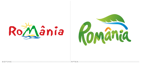
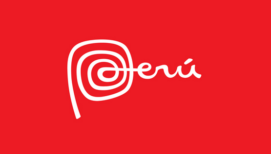
To start initial research, we decided it was best to look at some branding within cities, and how the city is reflected through the branding, and I will look at how a city is reflected, and whether the branding is successful to give a positive reflection of the city.

Romania 


Peru


Melbourne


Singapore


DEVELOPMENT 


INITIAL IDEAS

Our initial concept is to split leeds into 4 genres. These genres are what makes leeds interesting, exciting, and inviting for people to visit and enjoy. The categories will be split up into, Education, Retail, Art and Music.

Each section will be given its own "branding" as of such, which will be incorporated into a logo to allow the consumers understanding that leeds is a collection of these genres and show a range of exciting options.

The brand will have a clean, geometric style design allowing a aesthetically modern logo, created from abstract imagery and shapes that represent the genre of the section. This abstract will allow freedom to create exciting, new shapes that will stand out within leeds. In addition, the geometric style that was given to the branding, will be implemented into some structures, and installations that will be placed within the required section.

The colour will be separated into these 4 sections producing 4 different colour zones, however there will be a 5th colour that will represent an underlying colour that will capture and bring each coloured section together. The base colour will also act as a way of making leeds more interesting, applying more colour and making it an exciting atmosphere.

We split Leeds up into different genres to allow branding and identity for each genre. Splitting it up into different means of entertainment and making Leeds more exciting.

Education

We both decided that education is a massive aspect of Leeds. Students making up a big section of the community, and making sure that we could make this aspect interesting and relevant to the consumers of leeds.

Within the logo, we decided to look into the structured, motivated drive that the education within Leeds provides for the students. A way to reflect this would be a organised, linear type design that would reflect this education system.

We sketched up some abstract ways to reflect this feeling we both received and decided to work on this for one aspect of the logo.


LOGO


I started development on the logo. As we had sections already designated, we had certain shapes that needed to symbolise certain sections. The sections requiring designs for are as follows:

Education
Art
Retail
Music


EDUCATION


MUSIC


ART


RETAIL


COMBINATION

This is the final logo which includes a combination of each section working together as a logo. The 4 sections each have an individual pantone swatch which will brand that section as an individual zone to Leeds.


 PANTONE COLOURS


PICKING THE COLOURS 

ART

EDUCATION


RETAIL


 MUSIC


STRUCTURES

As I was completing the logo and picking the colours for the pantone colour scheme, elliot produced these renders using sketch up then applying them to real life scenarios to show how they would work.

ART STRUCTURE - A space for exhibitions and upcoming artists that will promote and display new pieces of art within a small structure situated near the gallery. It allows a way of promoting and getting the public involved with the art scene in leeds.

Windows including in the design will be in the pantone colour that is situated on the logo for the art section.


MUSIC STRUCTURE - A stage with various seats and places to proform allows users to interact, play, have fun with a built stage within the music area. The seats provided will be in the Music pantone colour. 


EDUCATION STRUCTURE - The education structure will provide a connecting point, providing students with a place to work, see, communicate and enjoy. A work zone which will allow students to work in a relaxed atmosphere surrounded by other students. 


RETAIL STRUCTURE - The retail structure will include a cat walk which will allow users to interact, take pictures, and have fun, but along side the catwork, includes a space for advertising for various shops, allowing mirrors, different promotional items for that season, and a whole section for new retail advertising within the retail area.