In the first session we looked at swatches, creating swatches and using them within design.
In the second session we looked at Gamut Warning, Taking the image, and giving feedback to the user about which colours will not be suitable for printing. This allows editing to the settings of the imagery.

Work in RGB mode, until you finish your image.
To remove swatches in photoshop, you hold alt and remove the swatch, this allows a brand new swatch palette to have a fresh palette.

The top part of the colour picker is colours that are not able to print, and then the bottom part to the picker is whether the colour is websafe.


Saving swatches for exchange allows the swatches to be taken from one program to another to make designing quicker and easier.
Duo tone can only be applied in the grey scale mode.

Choosing the monotone colour allows the whole image to be selected in the colour

Example of colour within the design.

this shows that the colour picked is clearly part of the pantone swatches as the name of the swatch includes the pantone selection.

choosing more colours gives the images more depth.


Choosing a spot channel as a new channel allows us to clearly see the printing process. The red transparency represents the inks that will be printed. You can style an image using spot colours to give a running theme.

you can also apply type to the channel layer.
In Design.
When working with photoshop items to take over into in design there are 4 things that need to be checked. The colour mode, CMYK or grayscale. The file format needs to be considered (.tif or .psd). The dpi (300 dpi/ppi) and the image has to be the actual size

When setting up the document, bleed and slug have to be considered, Bleed is to make sure there are no parts of the page that runs over, and makes sure the design fills the whole screen. The slug allows room for crop marks and various registration marks that might be needed
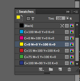
These swatches will be used to print the design.

Changing the swatches allows the design to have its own colour scheme that is ready to be professionally printed.

When taking the images into the design, the swatches link up and the swatches transfer into in design.

This shows the link between the files and shows the swatches link up to the other designs.

The link panel allows me to see the link and see the properties of the pictures.


The separation preview allows me to look through the spot colours and see what swatches print. It allows me to look which layer will be printed together. It also helps to screen print, creating the design both for commercial print and screen printing.
This is the best way to check what colour swatches are being used.

Using the separation to print individual sections. This only works on ink jet printers.
If we are outputting the positives, we have to work with halftone dots. Frequency for the design will be used to make the halftone. The angle of the halftone has to work with the 2 grids of dots. the angles should be 15, 75, 105, 155 for a 4 coloured design.

the attributes allows an overlay of swatches, instead of the swatch actually blocking it out, it will overlay the colour over the top of the design.
No comments:
Post a Comment