BRIEF


Looking into the DandAD I found this brief really interesting. As we have already completed a film poster brief in first year, I was interested to start this brief as I believe with the new skills I have acquired throughout second year. It means I can produce a much more relevant response with in depth analysis and a strong concept.
A system that will rely on and relishes words instead of using photographic system. without imagery, type alone will create an equally, even a more compelling visual expression.
I am excited to start research for this brief and start creating some ideas as this brief will be exciting to complete.
I made a plan for this brief and listed each aspect I will look at:
-Research: Films, genres, money made, audience, trailers, type within films.
-Initial Ideas: Sketches, mockups, type experiments
-Concept: Explanation into concept
-Stock tests, presentation of films, reaching the audience
-Promotional ideas, experiments.
RESEARCH
I started by listing films that I would be happy to produce work for, including my favourite films, and genres. I wanted to stay away from some of the bigger, more popular directors as I wanted to produce a design for a set of films that aren't as popular and allows room for more interesting and innovative concepts. Below is a list that I have produced to display films that I would produce work for.

I looked into the work of Luc Besson, including films like The Fifth Element, The Professional, Taken, and the Transporter series. I want to design a typeface for a crime or action film, and Luc Besson has a good selection of movies to design for. Whether I would take a series of film (Transporter) or an individual film such as Lucy or Leon: The Professional.


Transporter


After looking into the transporter, and realising that the audience for this type of genre is quite open and I believe I need to refine my idea and look into genre of film to create a better design for the required audience.
I started to look at Monty Python and there films, as I understand their audience is quite older and the younger generation are ignoring the fact that this type of surreal comedy surreal comedy is hilarious, and is being forgotten about by the new generation.


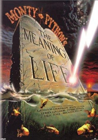
Being a fan of the Monty Python sketches, and having watched some of the films, I picked my favourite films to look into and research. These films are Monty Python and the Holy Grail, Monty Python and the life of brian and Monty Python and the Meaning of Life. These 3 films are hilarious however, they are quite dated so people don't give the films chance.
Monty Python are a British surreal comedy group who originally created their first sketch comedy show "Monty Python's Flying Circus". Forty-five episodes were made over four series. They developed from their television series into a larger project. with both scope and impact, creating touring shows, films, albums, books, and musicals. The influence on comedy has been compared to The beatles influence on music.
This inspires me to create a piece of design which audience will understand as the sketches are well known, and the audience will be interested in the design work, as they are a fan of the film, and if I get the designs how I want them to look, they will instantly recognise the type of genre and be able to understand that the poster relates to era of the Monty Python years.


One thing I immediately noticed when looking into some movie poster design for Monty Python are the big use of 3d imagery and type. When looking at these I get the feeling they wanted parts to stick out, catch your attention and stick out from the rest of the design. I wanted to incorporate this into some of my designs.

I started to think about using the idea of layering and 3d typography to create some sort of negative space to display something. An idea that came to my mind was using the best lines and the most memorable quotes and creating an layered typography piece to create imagery relevant to the quote. Even some people who haven't seen the film know quotes from it, so producing memorable poster designs will catch peoples attention.
RESTART
After looking further into Monty Python and getting quite stuck as to where to take it, I decided to look into the director further and look at some more of his work. I realised that the Terry Gilliam has also worked on the 3 films, Time Bandits, Brazil and The adventures of Baron Munchausen. Also known as the Trilogy of imagination. These films are older, ranging from 1981 to 1988. For the people that just can't get into Gilliam films, I hope there's another filmmaker that inspires childlike wonderment in you. Because it's a great feeling. Time Bandits is magic. It's a fine example of a movie that works for children and adults alike. I appreciate the social commentary on consumerism, the Python-esque humor, and just how imaginative and skillfully done the movie is. Terry Gilliam is one of the more innovative, creative, and fantastical directors of the last two decades. His films easily bear his stamp of absurdist humour, witty dialogue, sheer fantasy, dream-like sequences, and always a generous dose of black comedy.


The films show the craziness of our awkwardly ordered society and the desire to escape it through whatever means possible. They focus on the struggles and attempts to escape through imagination. I believe this stronger idea will allow me to produce more interesting and relevant designs.
Brazil
The Adventures of Baron Munchausen
Looking at the style of the films and the absurd humor and dream like trailers and the use of dark comedy, allows experimentation with a imaginative, creative, typeface to represent this type of humour.
Themes
- Fantasy
- Some kind of magic
- Magic Realism
- Expanding how you see the world
- Hammered and hammered to think what the world is.
- Television is saying, everything is saying, "thats the world".
- Its not just a world. The world is a million possible things.
Initial Ideas
After looking at the sentence "Craziness in our awkwardly ordered society and the desire to escape it through whatever means possible." This made me experiment with ways to produce a way to show this "escaping" to the viewers.

I started to draw up experiments using different coloured stock and sections removed. This made me think about creating something that incorporates shadows to display an image on the wall. Using removed sections of a poster, and creating this platform to produce shadows which will provide this feeling of escaping reality.


Each film will have a film poster, however, within this film poster will be perpetrated edges that will be removed to create a section of the shadow. The type will provide negative space and aspects that can be removed to create the artwork.

The typeface will also change gradually, I want to incorporate a typeface that looks modern and new, then with the progression of films, it will allow the typeface to have a gradual age difference.
The 3 films will be displayed in a pack that will be used to hold each film poster. Sections of the type on the pack will be removed allowing the design to shine through to show each section of the poster, giving a layered, interesting pack that wants to be explored.
With the aspects of design that gets removed from the design, I want to experiment producing a stand that gets produced when folded, to give a format to shine a light through the design to give the shadow effect.
The 3 posters could reflect the different type of imagination that gets displayed as a person gets older. The child's imagination will be wild, unique and fresh, allowing interesting shapes and exciting designs as the imagination is fresh and new. The middle aged imagination could be a mixture of imagination and the problems that occur, so having contrasting shapes, and aspects of the film incorporated within. The older imagination will be related to the outlook of the film, and what has been realised throughout his life.
For research I looked into different aspects of shadow art, and the production of shadows shining light through gaps. This will create an interesting composition, but working with the aspects of
Time Bandits Poster

"A young boy accidentally joins a band of dwarves as they jump from era to era looking for treasure to steal."


For a poster design, I believe the time bandits map will create interesting shapes and compositions which could be used for shadows and removing sections as there are linear sections all the way through the design.
One way I want to improve the typeface, is to produce something that will reflect the escaping from reality, and accessing this imagination. The typeface will be quite futuristic including aspects of the type that will be unique and reflect the sheer fantasy that is portrayed within the films.
Scenes for shadow art


Shadow Sketches

Brazil Poster

BRAZIL is a film rich in depth. The plot does not focus on just one subject, but instead contains many different themes which weave together. The film follows the character of Sam Lowry, a clerk in the records department of a huge government bureaucracy, the Ministry of Information. Sam's perception of the world alternates between being trapped as a mere "cog in the machine" in a grim world of paperwork, and escaping from his grim existence by becoming a hero in his own elaborate dreams. His life and these dreams begin to merge together...his dreams become more realized as his life tears apart. Eventually, the government imprisons him, finding him guilty of none other than "wasting the Ministry's time and paper" after Sam embarks on a messy pursuit of the girl he sees in both his dreams and in real life -- who was unrightly wanted by the Ministry as a suspected terrorist.

There is a retro-futuristic quality of this neon title screen for Brazil. From the title designer, Richard Morrison,
One way I want to improve the typeface, is to produce something that will reflect the escaping from reality, and accessing this imagination. The typeface will be quite futuristic including aspects of the type that will be unique and reflect the sheer fantasy that is portrayed within the films.
Scenes for shadow art
Shadow Sketches
Brazil Poster
BRAZIL is a film rich in depth. The plot does not focus on just one subject, but instead contains many different themes which weave together. The film follows the character of Sam Lowry, a clerk in the records department of a huge government bureaucracy, the Ministry of Information. Sam's perception of the world alternates between being trapped as a mere "cog in the machine" in a grim world of paperwork, and escaping from his grim existence by becoming a hero in his own elaborate dreams. His life and these dreams begin to merge together...his dreams become more realized as his life tears apart. Eventually, the government imprisons him, finding him guilty of none other than "wasting the Ministry's time and paper" after Sam embarks on a messy pursuit of the girl he sees in both his dreams and in real life -- who was unrightly wanted by the Ministry as a suspected terrorist.
“The optical effects in Brazil have quite a timeless quality to them. I did not consciously set out to create something so lasting. It was more of a serendipitous happening.”
Scenes for poster art


The Adventures of Baron Munchausen Poster

A magical film about the power and importance of storytelling and imagination. The creation of the ever fecund mind of Terry Gilliam. Filled with a spirit of adventure, and a deftness far too rare these days, it is the delightful tale of the adventurous life of Baron Munchausen. He is a hero of the grand old sort, a kind of 17th century James Bond.
Baron Munchausen has a knowledge of fine wines, is popular with the ladies, and is the finest soldier in the kingdom. He has a band of sidekicks (the fastest man, the strongest, one with amazing sight, another with amazing lungs and hearing) who assist him in fighting the Turks; traveling to meet the King of the Moon; falling into the center of the earth to meet Vulcan and Aphrodite; and playing cards with the Grim reaper, after being swallowed by an enormous monster-fish the size of an island.
Along the way Gilliam's wit skewers rationalism, science, realism, practicality and pragmatics. As much an explication of faith as a depiction of what makes life truly worth living, and what is worth dying for.
Scenes for poster art

Typography
For my the type that would be included in my design, I wanted to reflect the idea of the age change between each film. Starting off with Time Bandits, being a film through the eyes of a young boy, an amazing adventure whilst being pursued by evil. Brazil is a film that explores a middle aged man and his battle to escape his life and release himself to become a hero in his dreams. This explores the change from normal life, to a more exciting and adventurous life. The Adventures of Baron Munchausen explores the power created from storytelling and imagination. it explores methods to prove what makes life truly worth living for, and what makes it worth dying for.
Poster Combination (Shadow Concept)
The shadow concept was something that was derived from my research. Coming to the conclusion that each film explores the importance of escaping reality, and the use of imagination, I believed that having an interactive element that involved the removal of sections within the design to allow a stencil creation from the design, this then forms a basis to apply shadows and create art from within the poster design.
The sections that will be removed will cut, change, manipulate type as sections are removed, creating art from the type sections. This will also form a shadow stencil, which will provide a quick insight into what will be expected from the films.


The posters can work separately, however, I intend to produce 3 poster designs that will work together as a set and create a piece of art using all the shadows together, this suggests the figure of imagination.
The posters will be kept together by a pack, which will allow a clean, front cover, to display the shadows through the front of the pack.
The shadow I had in mind was to produce something that reflected the escape from the world and showing the world has a lot more to it than it seems. It also related to each film as all 3 are about a crazy adventure and unexpected problems that occur.
I had an idea to show the type of shadow that would be produced when the design was given a light. It represents the mouth grasping the object within, with connotations to a shark that is in the last film, and the progression from one design adding on top of each poster to

I experimented with sections removed to make sure the shadow was correct and could be removed easily with the perforated edge.


I came to the conclusion the posters needed a pack to hold each poster and then also works as a stencil to neaten up the shadow, providing a nice clean circle that provides a clean shadow.


The sections of the poster that can be removed will be raised slightly so the consumer instantly knows what do to.


This shows how the poster will fit into the design. It has the design that will be unrevealed through the pack, and the section removed will be used as a ticket stub for the screening of that particular film.


The pack removes the front section using perforated edges.

As you can see below, the front, and the back of the pack are easy to remove and allow a stencil for the posters inside to create a shadow piece.


This shows the design when all the posters are lined up to give the final shadow design. The shadow can be perceived as a big mouth, vicious teeth, grasping something within its mouth. (a scene from the last film)

This shows the whole entire collection, including the shadow pack that a customer will receive, and a the posters with sections removed to provide the relation to the shadow pack.


The pack will have a section at the front, and the back which will be removed. This interactive element provides a fun, interesting way to get the user involved, and allows a more memorable promotion which the user will remember.


